Kelly Peng · Visual Design
01 / 79
Kelly Peng · Visual Design Portfolio

Visual
design
that ships.

Projects + Freelance · Brand Identity / Graphics / Motion Design
Visual design, for me, is

giving a brand one clear voice. turning taste into repeatable systems. making complex products feel simple. craft that survives real production.

Projects + freelance work: a fintech brand with motion, a full visual identity guideline for a lighting company, and a brand system built end to end. Identity, guidelines, campaign assets, and motion — all from one hand.

Projects + freelance. One visual standard.
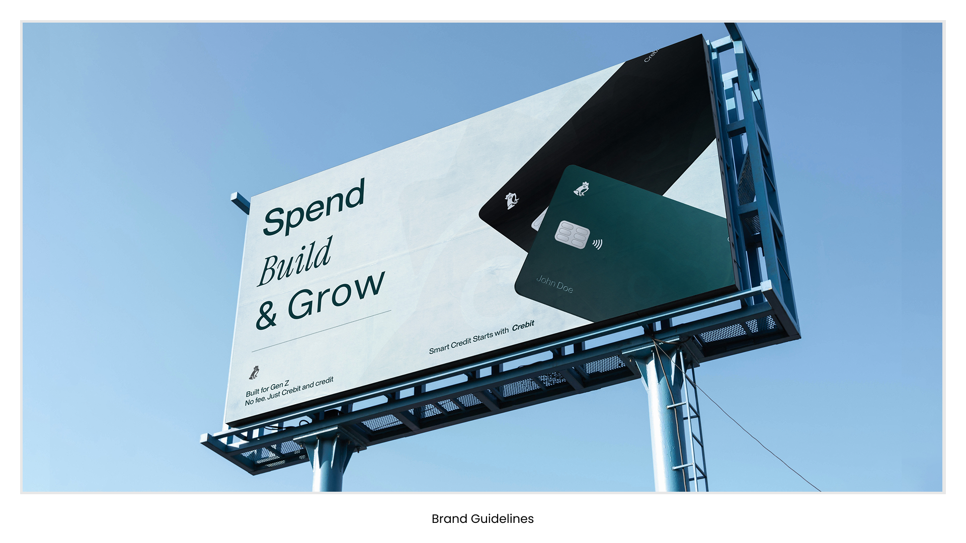
Crebit
"A fintech brand that moves — identity, campaign, and motion design."
01Brand identity
social assets + motion
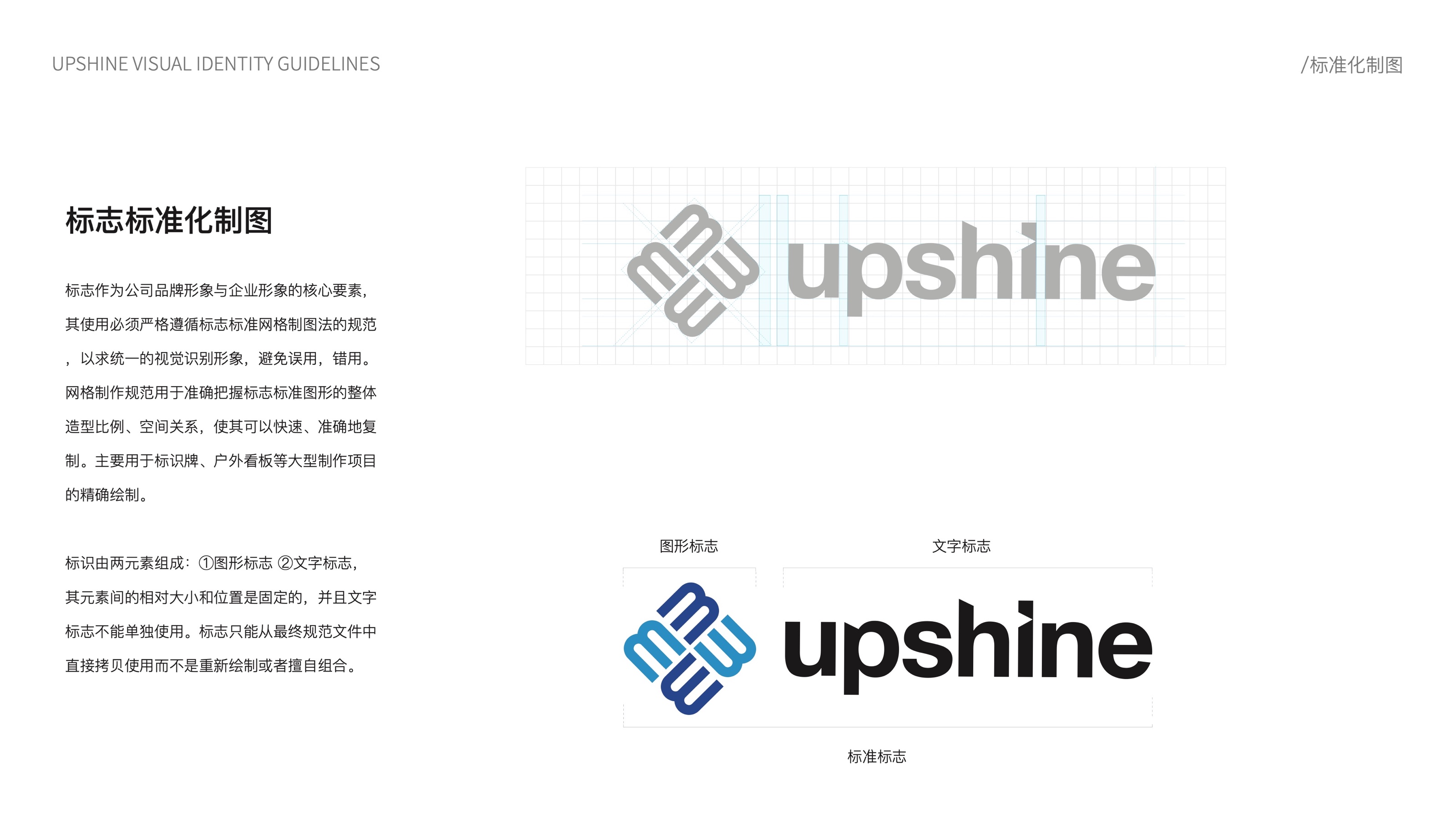
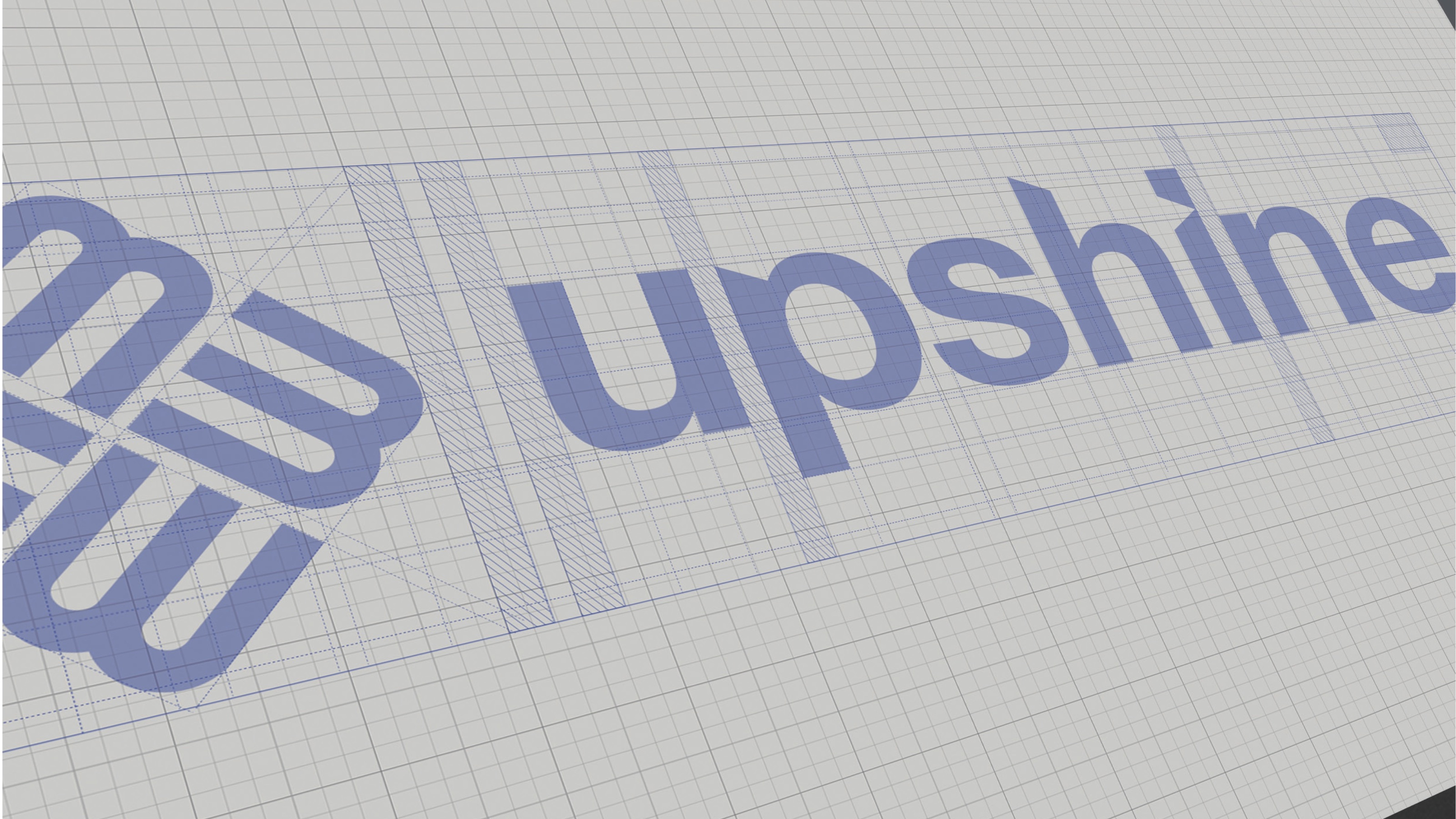
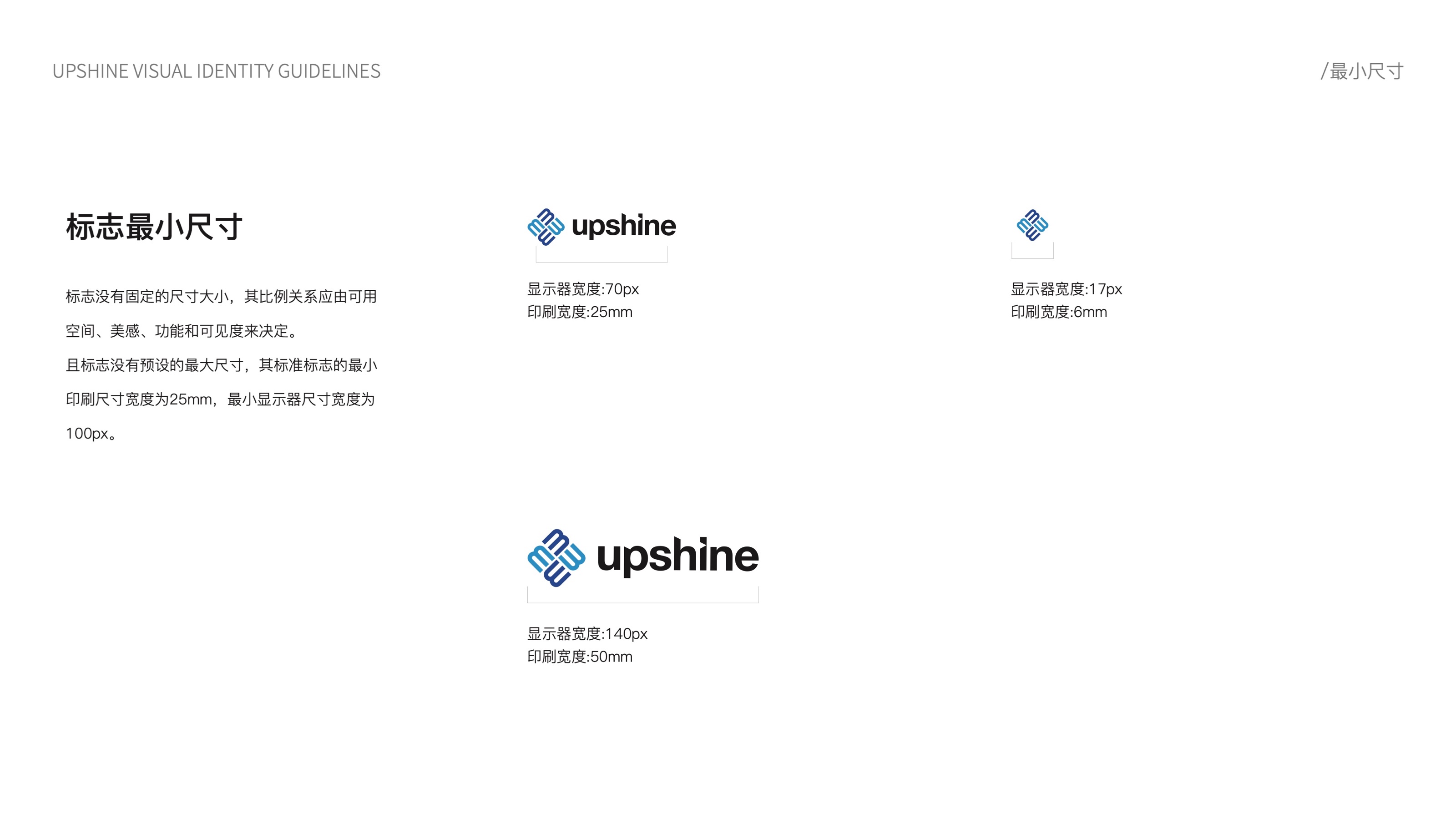
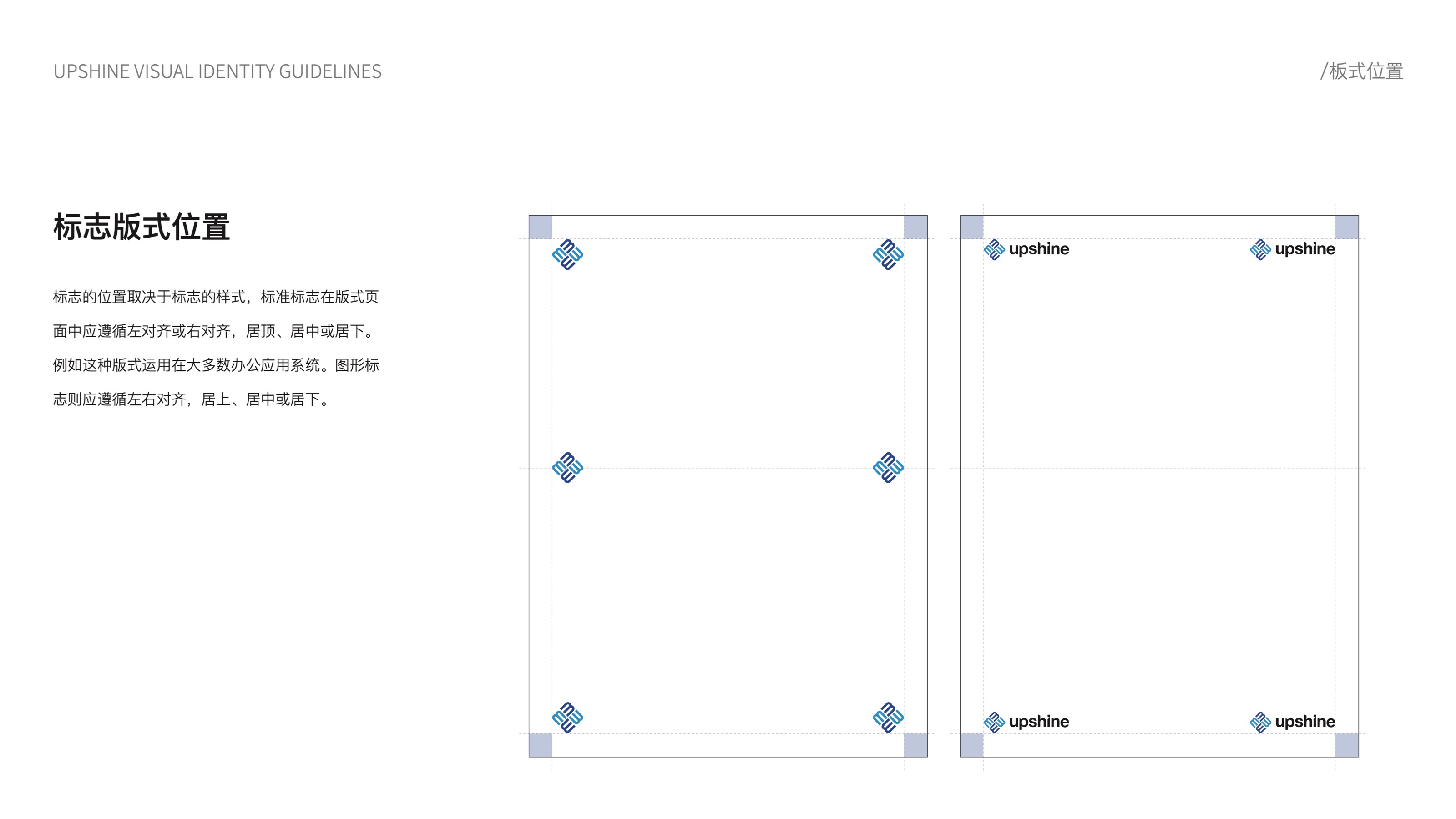
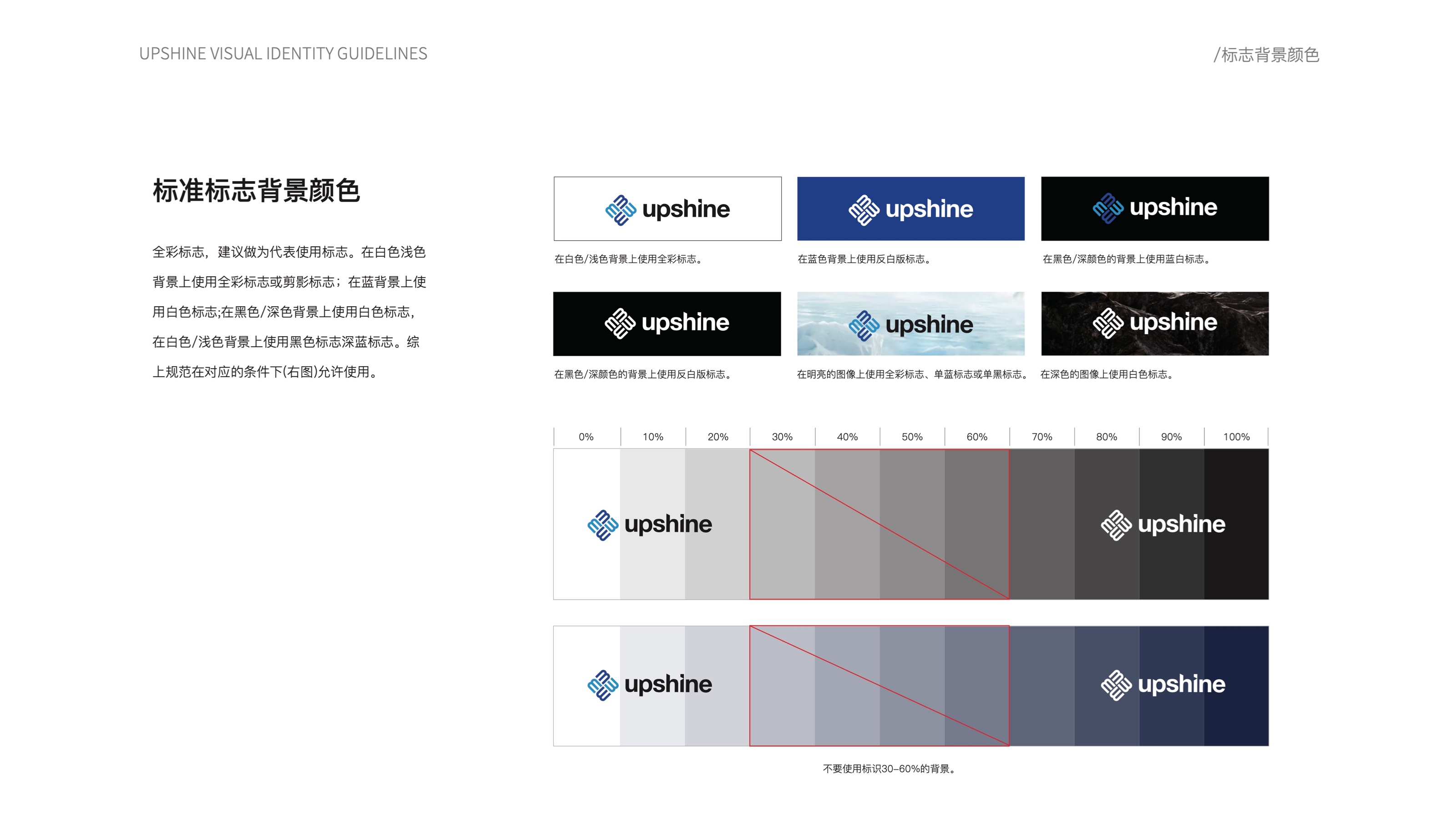
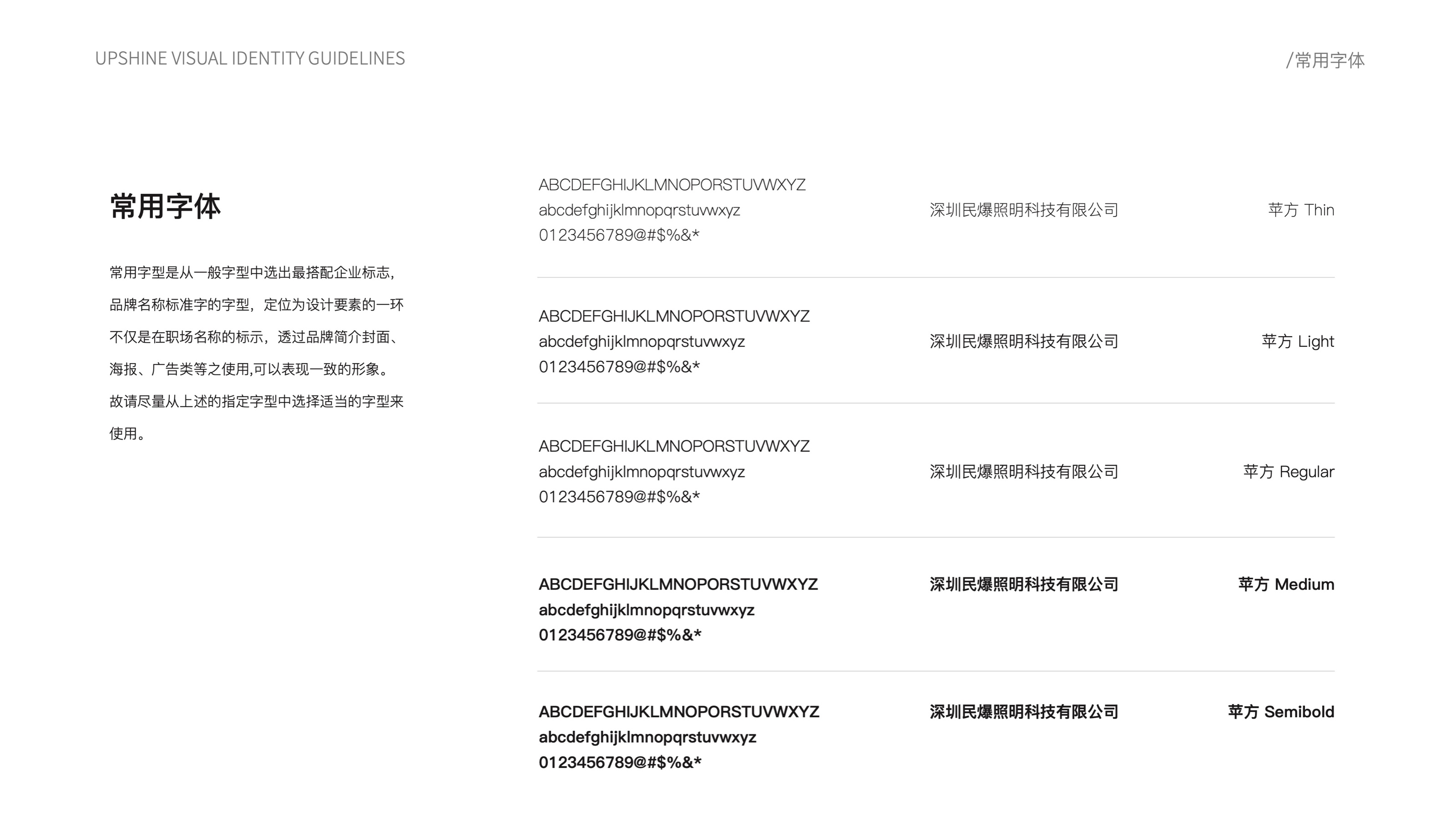
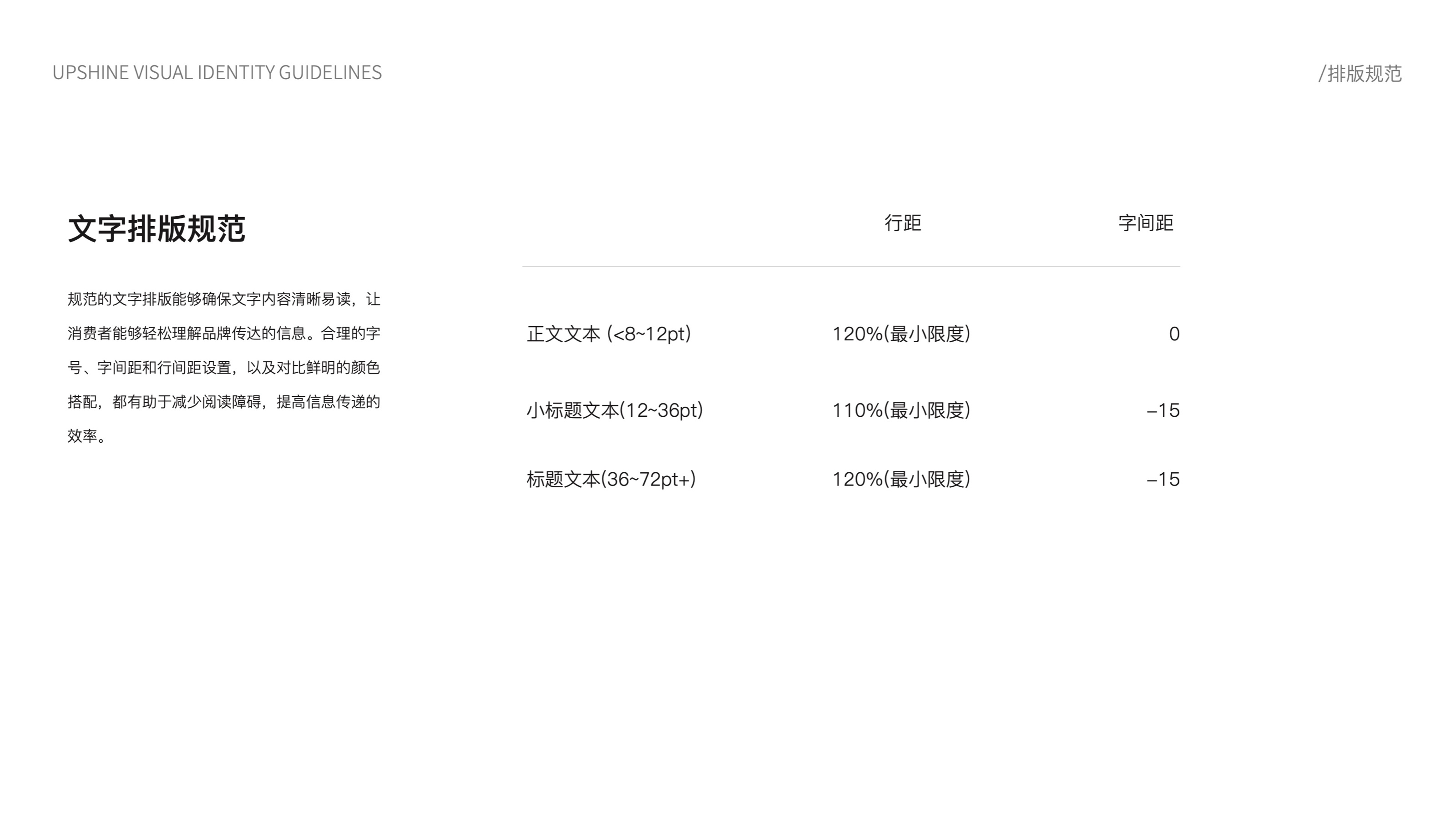
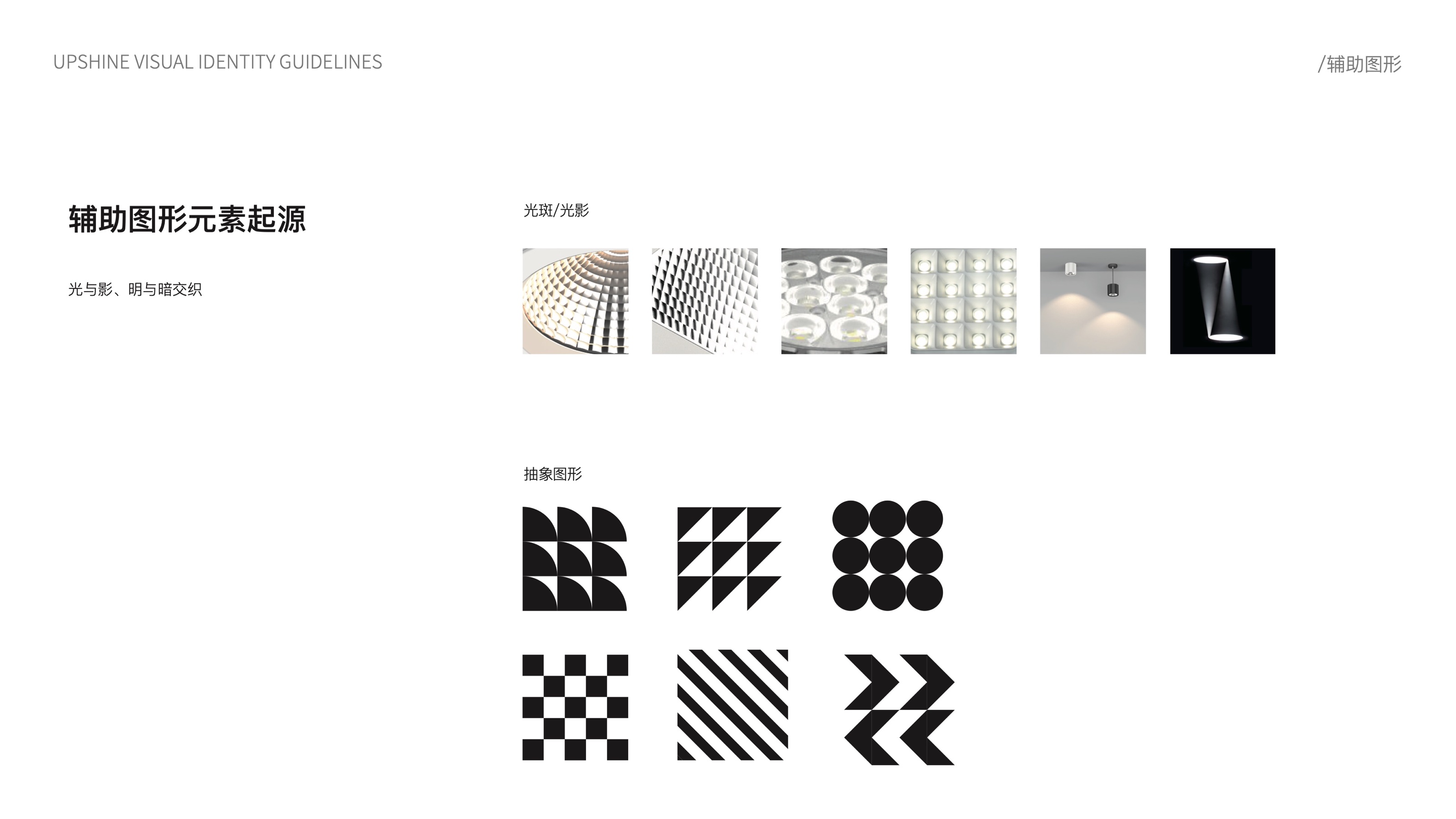
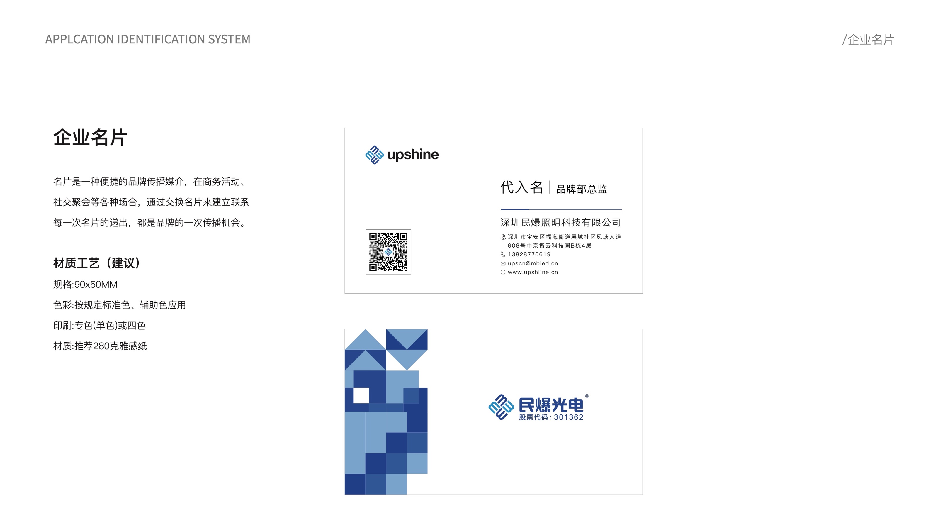
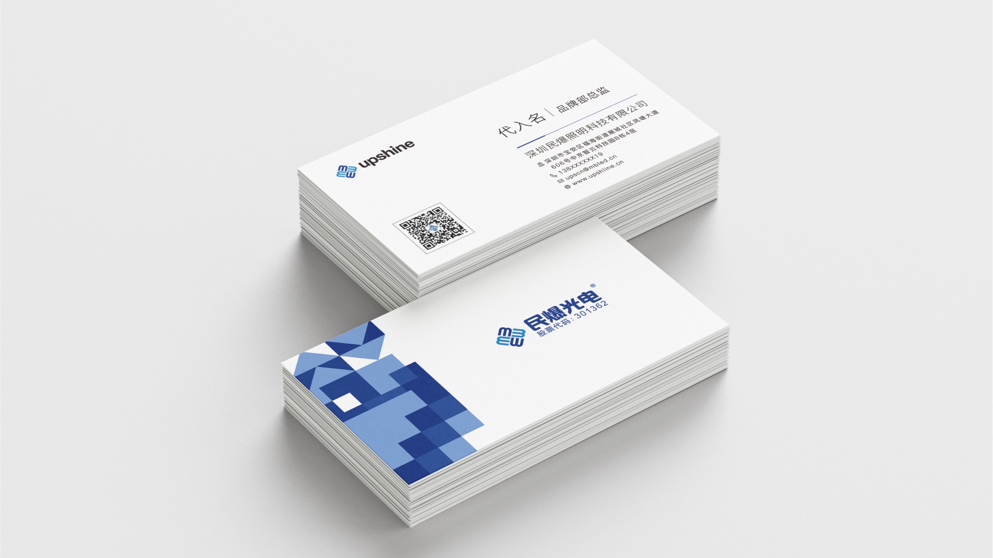
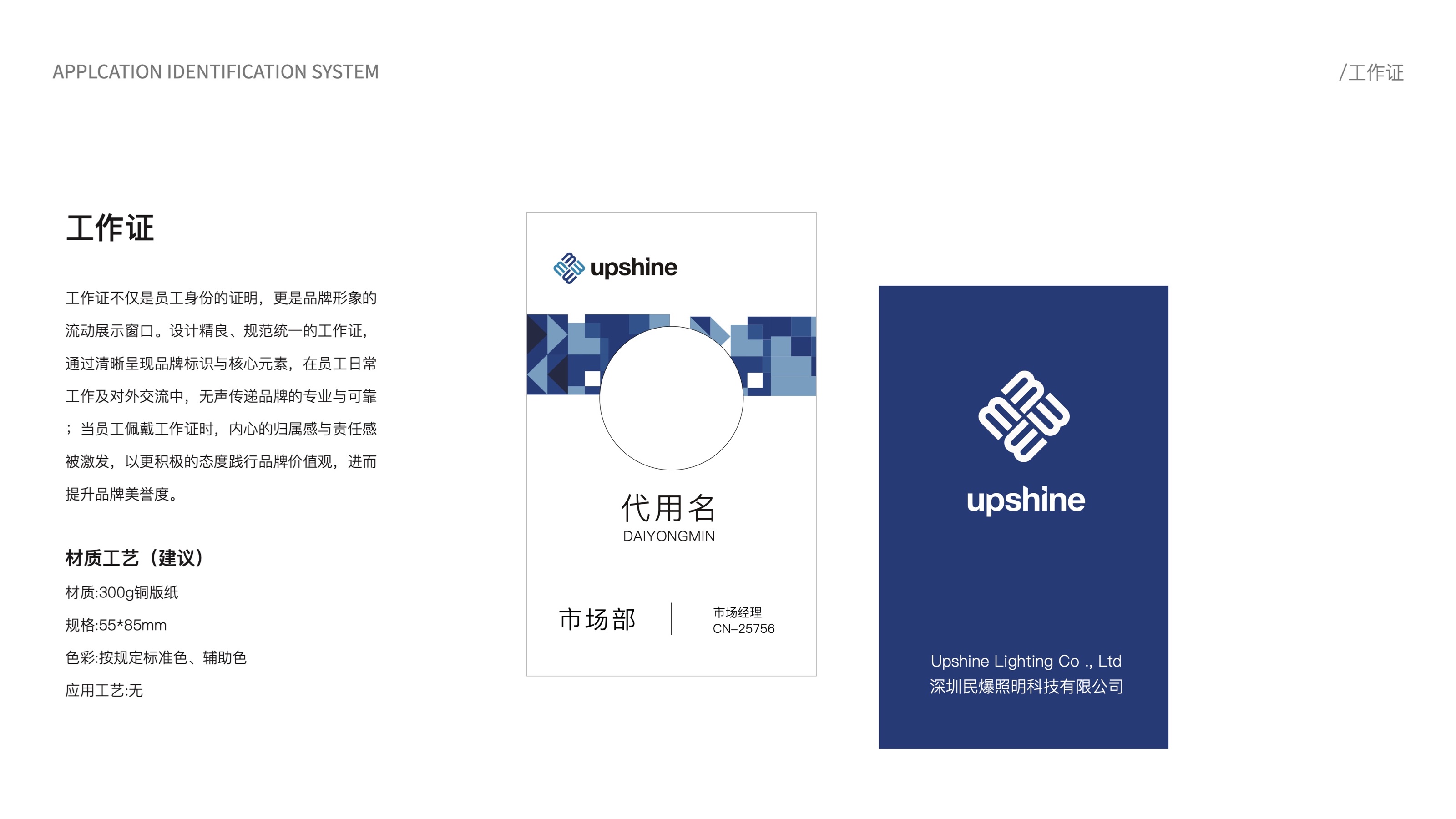
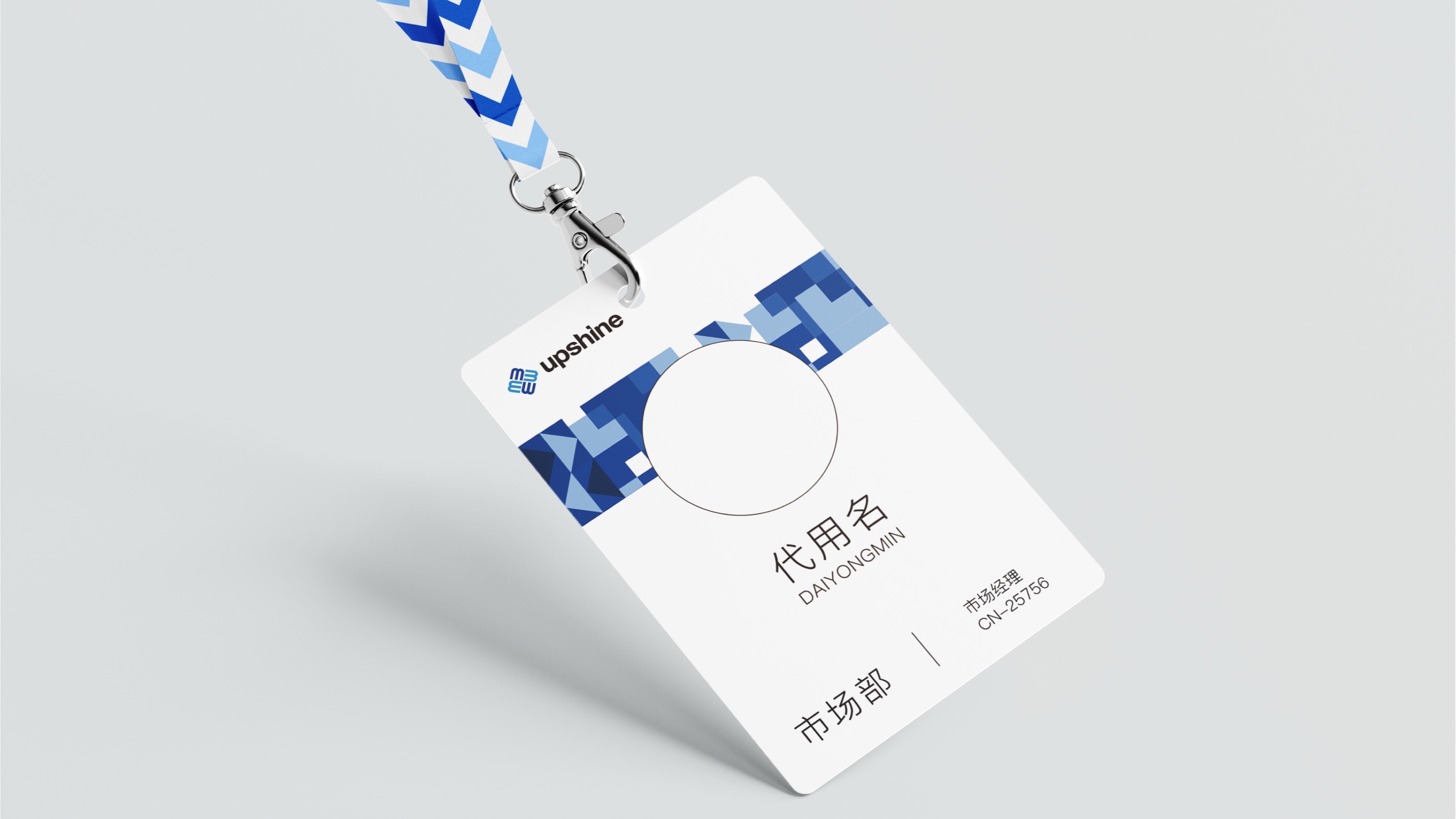
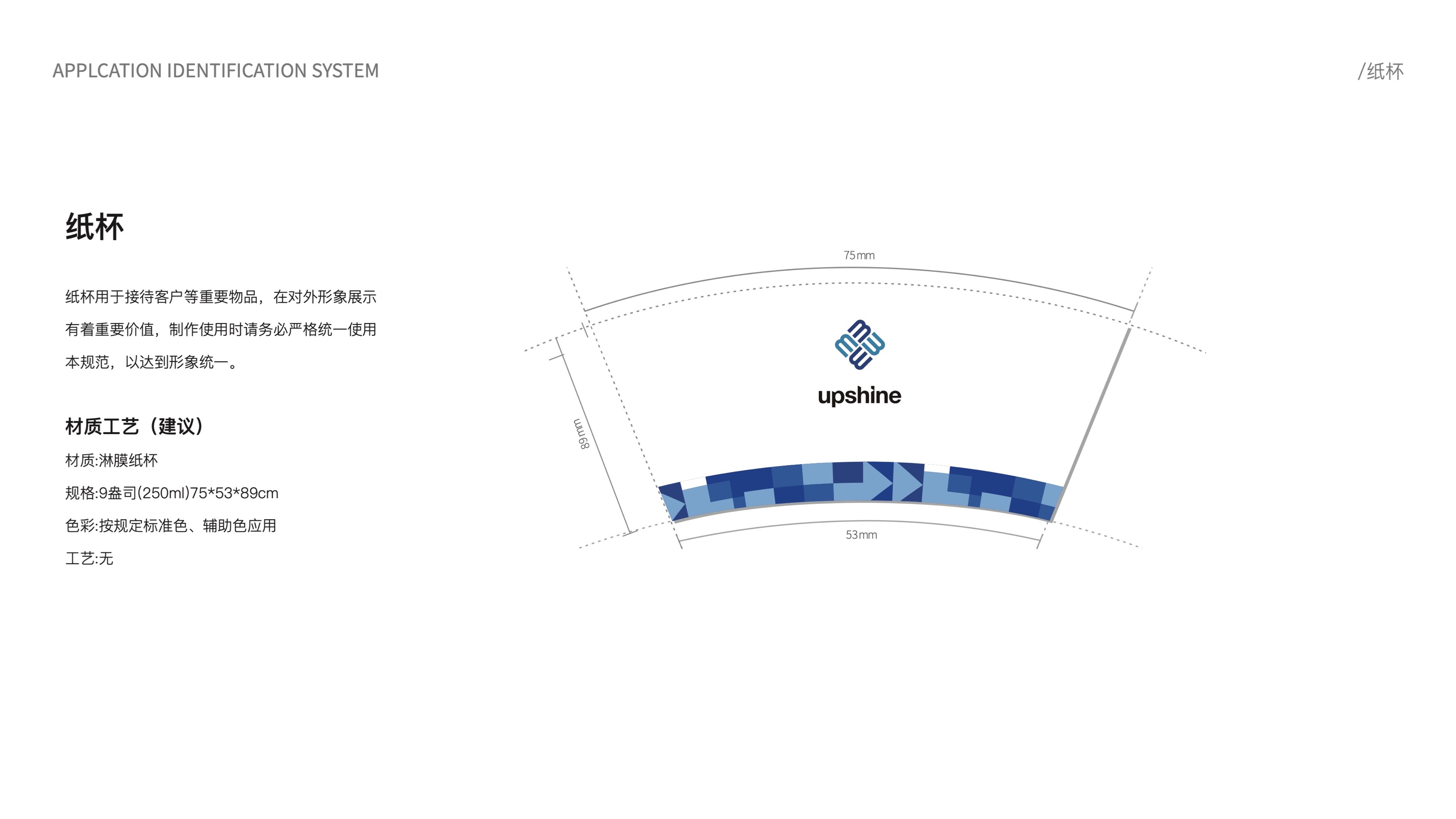
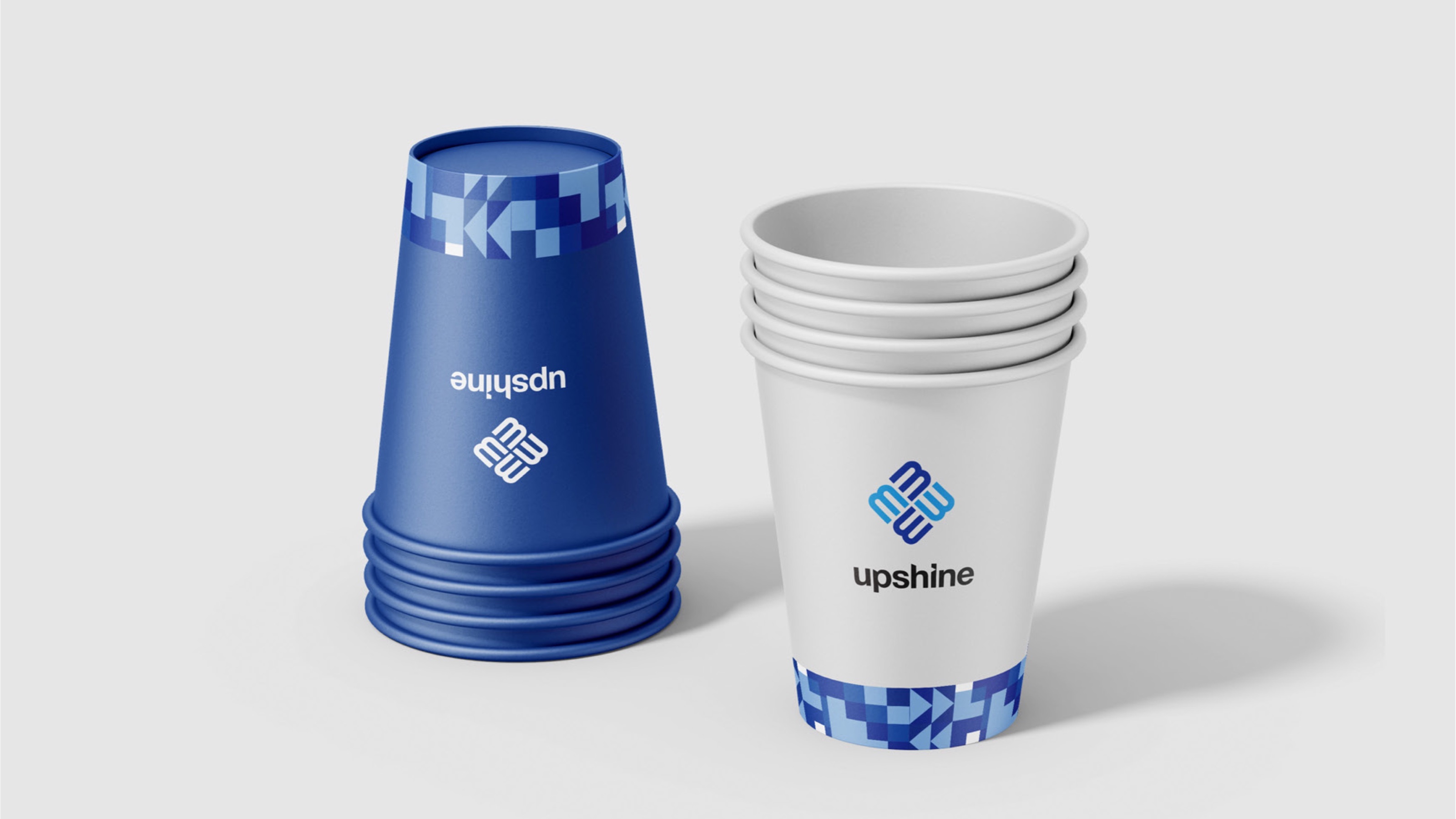
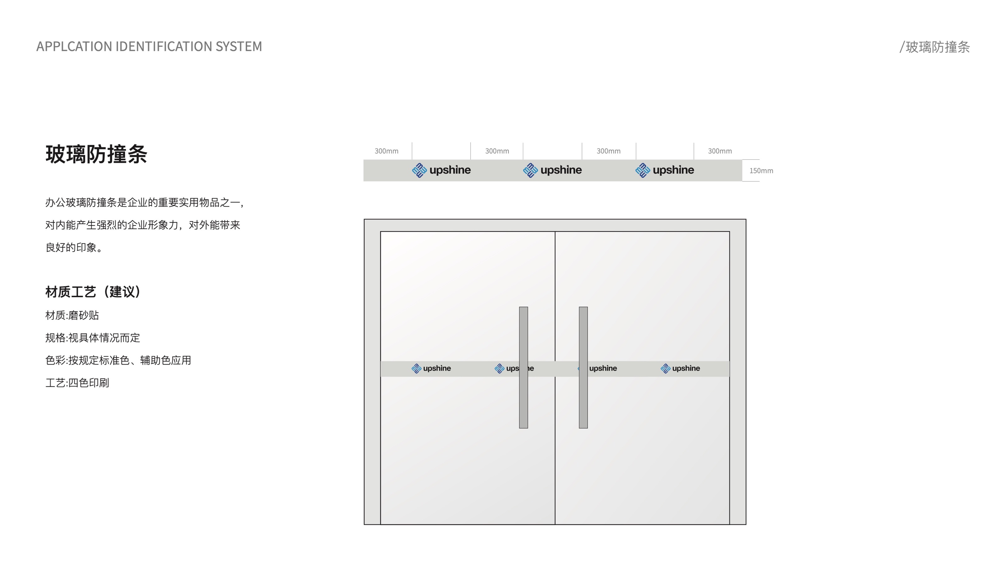
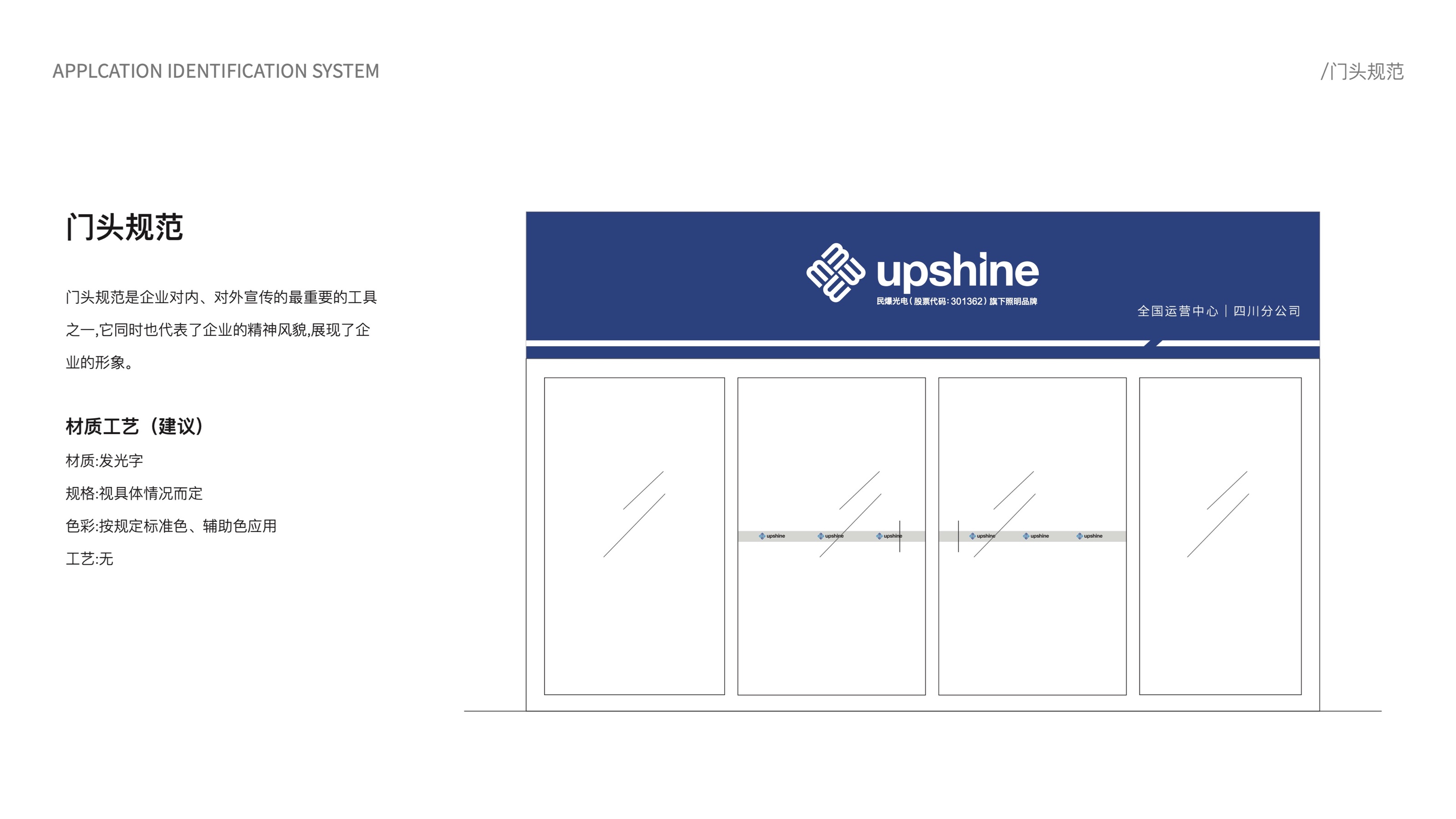
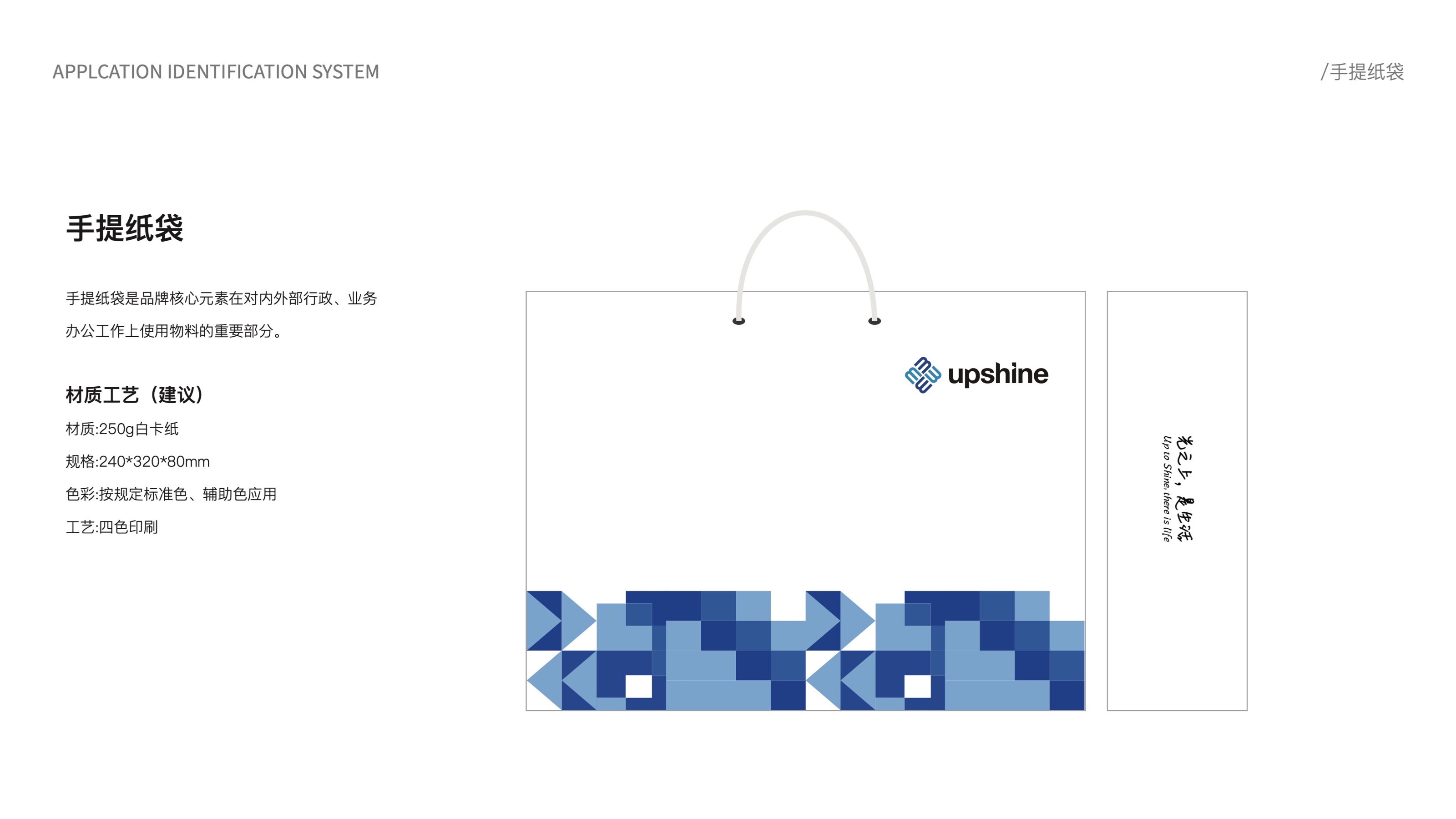
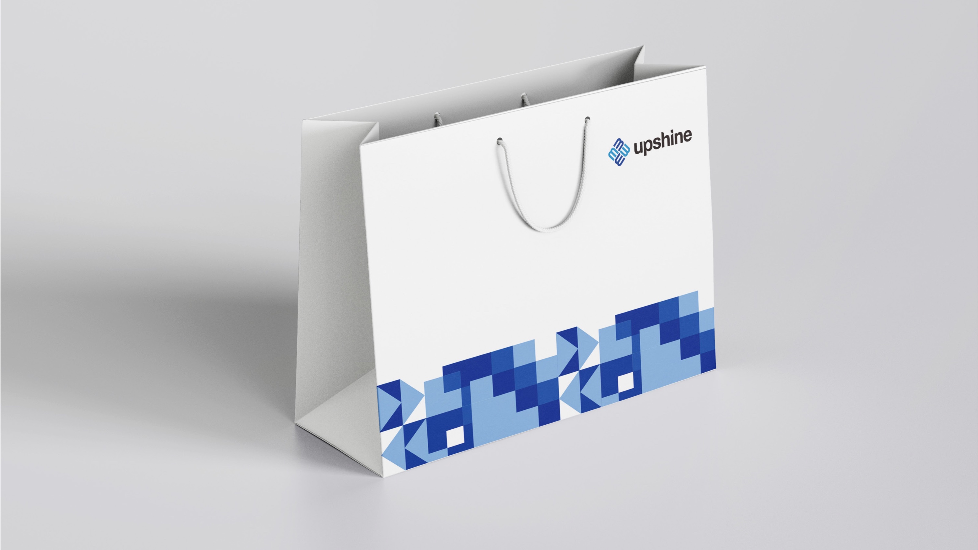
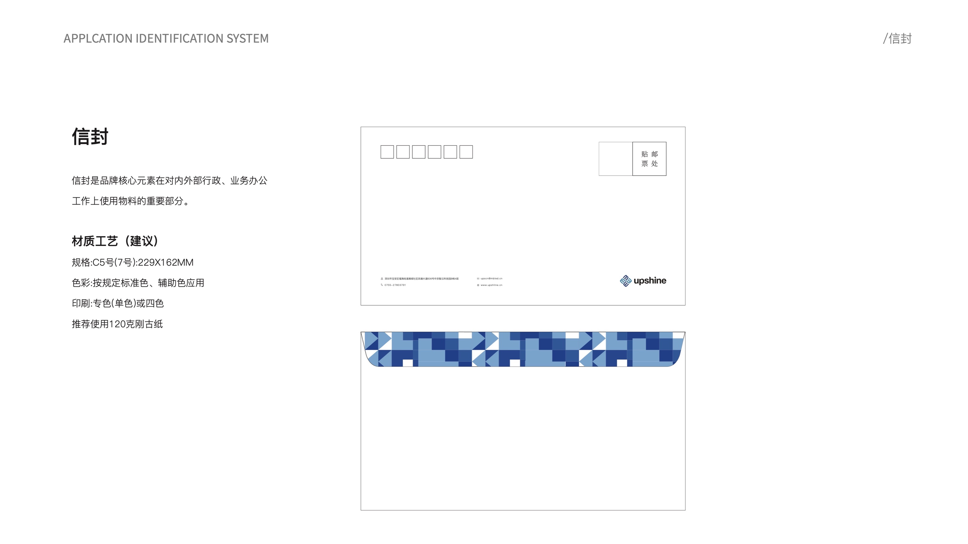
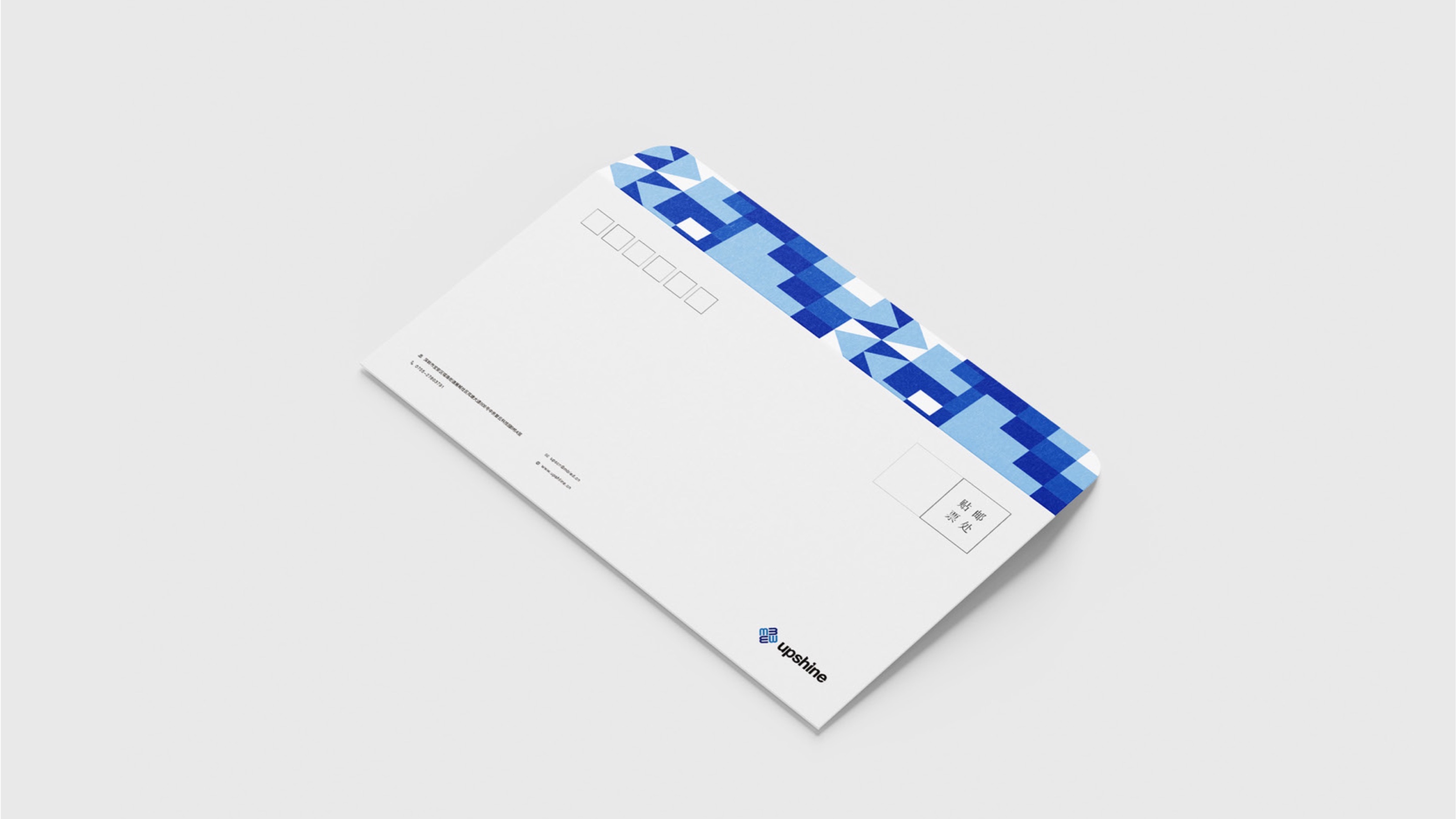
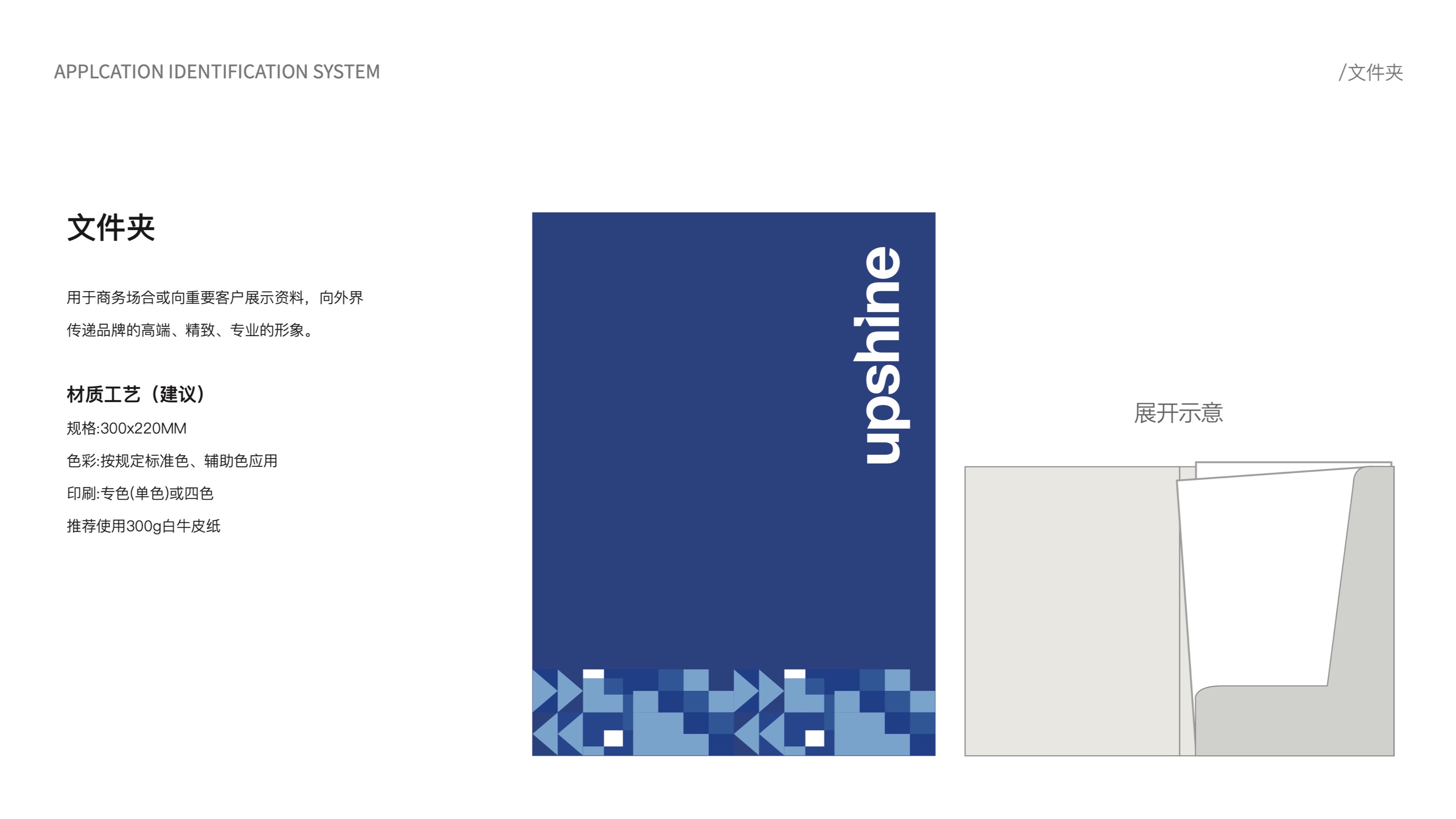
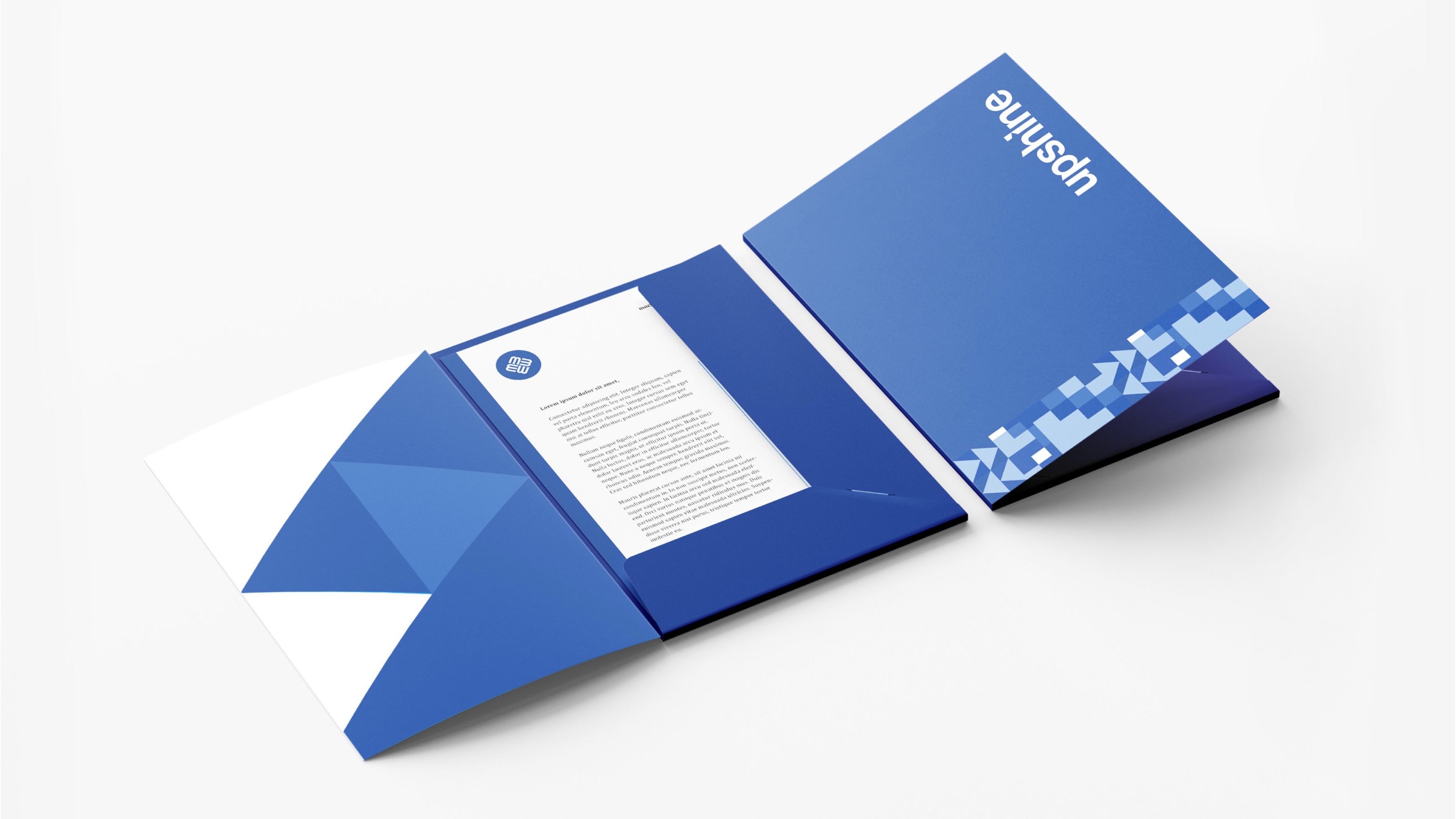
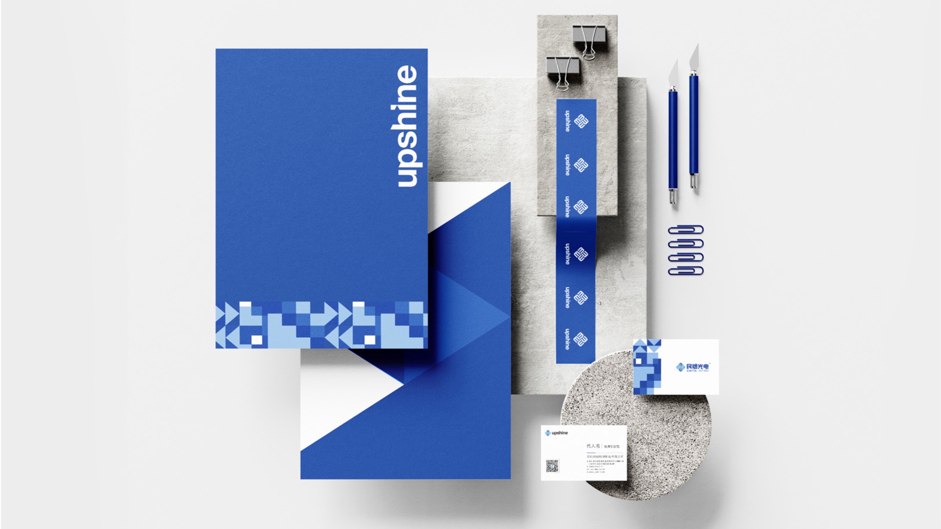
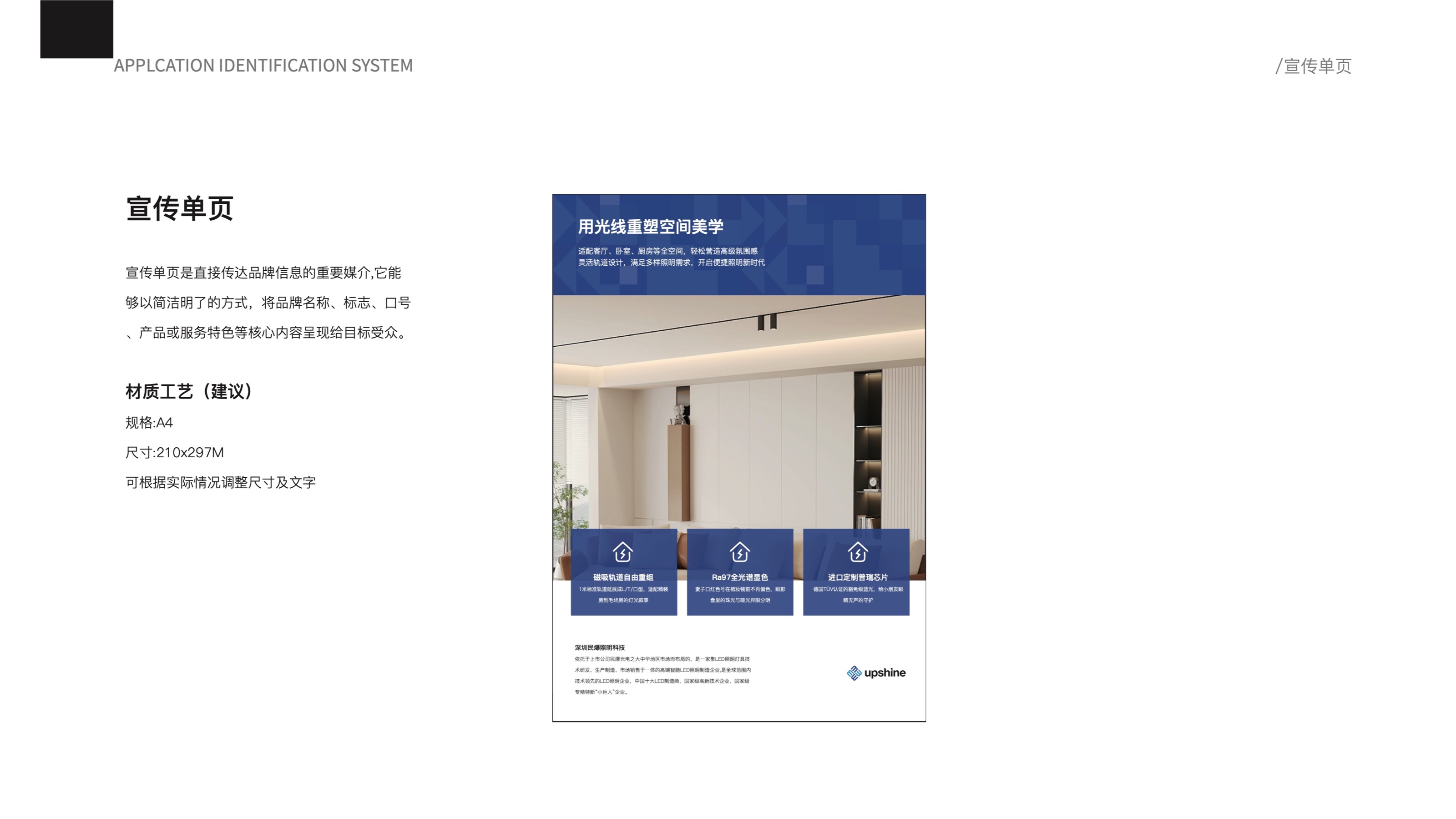
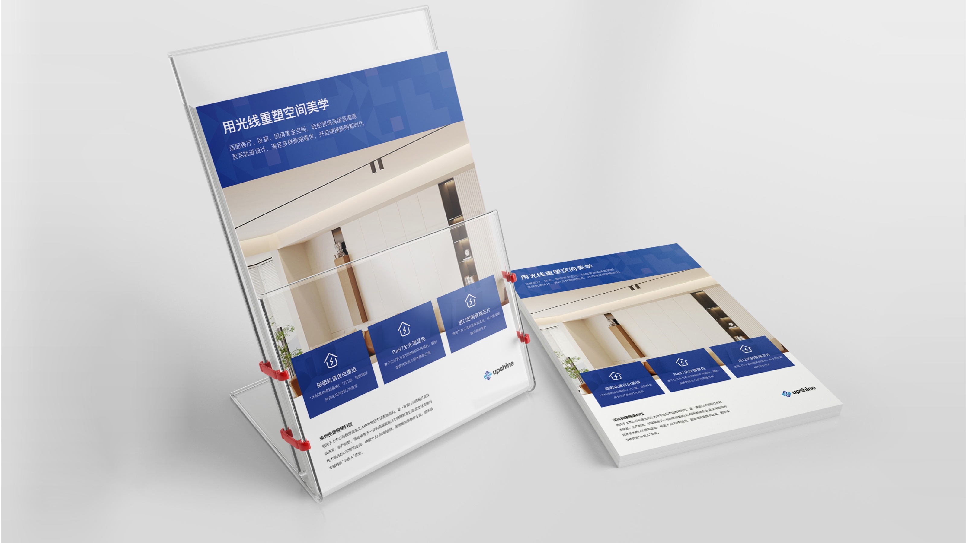
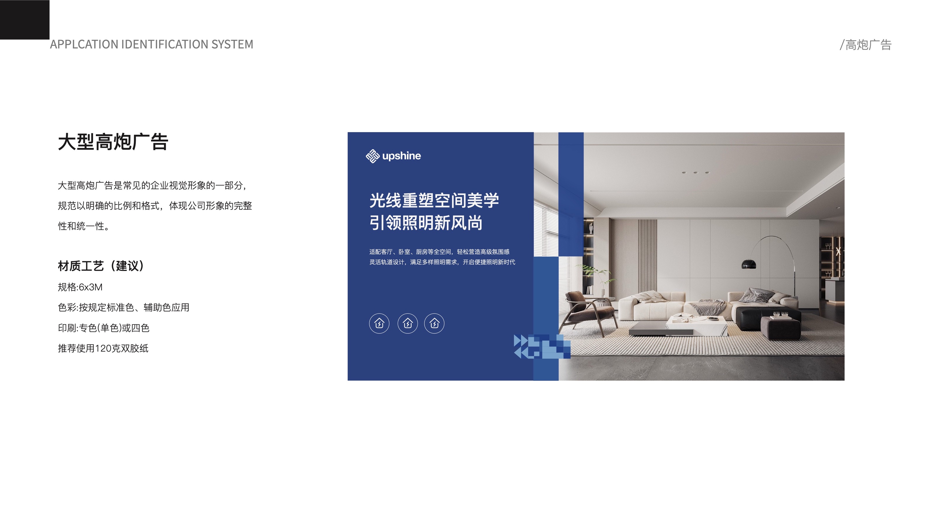
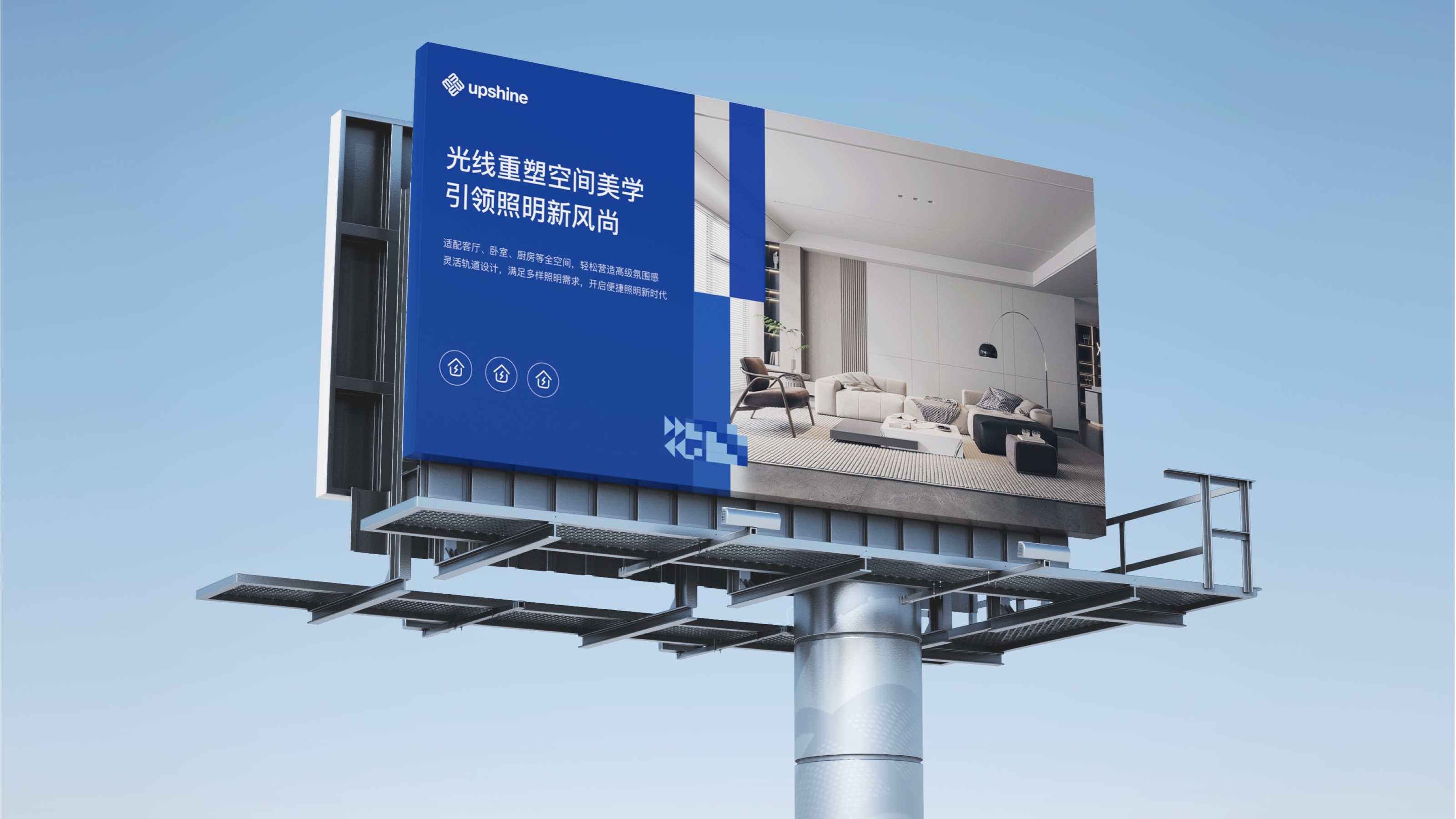
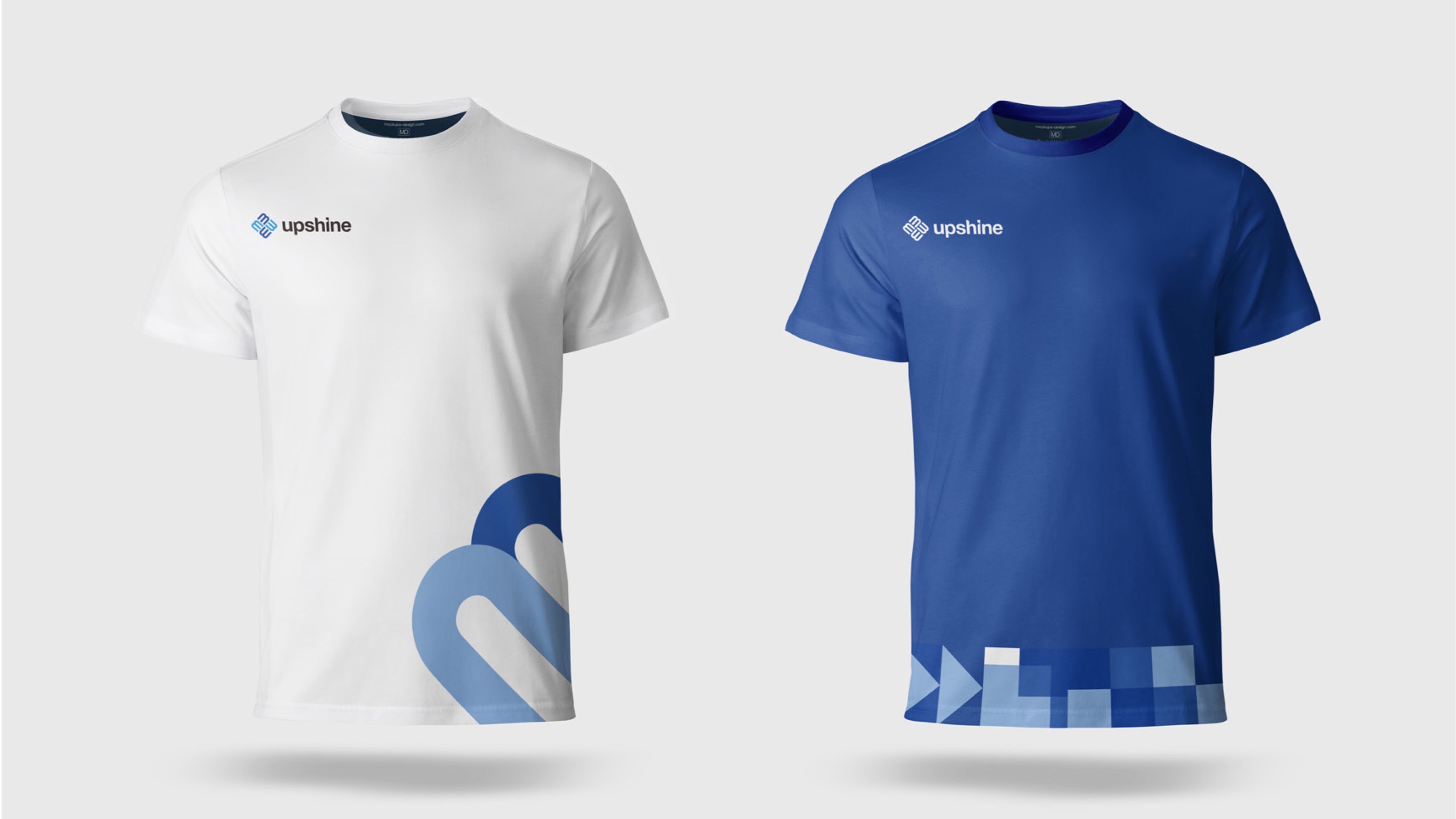
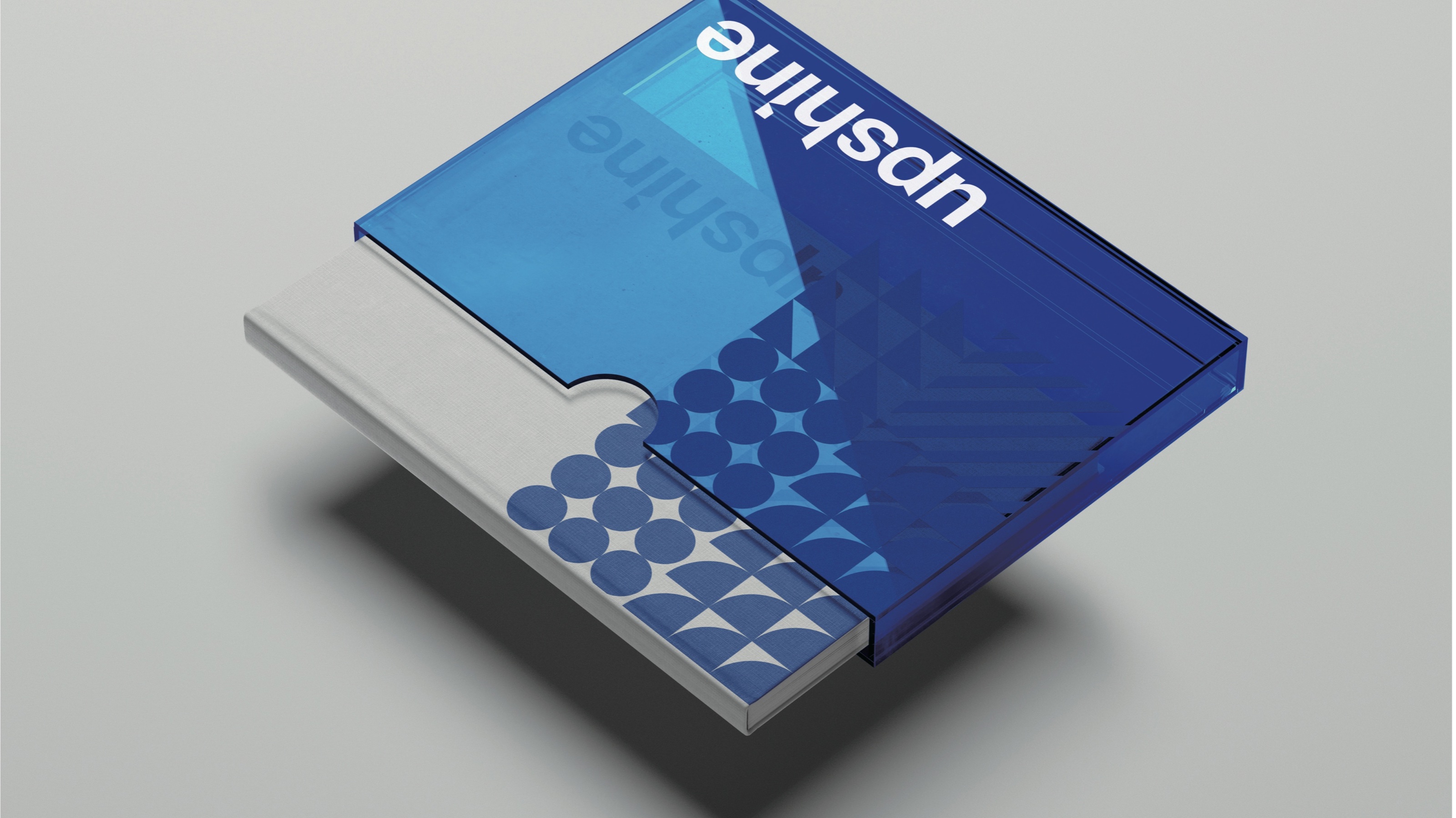
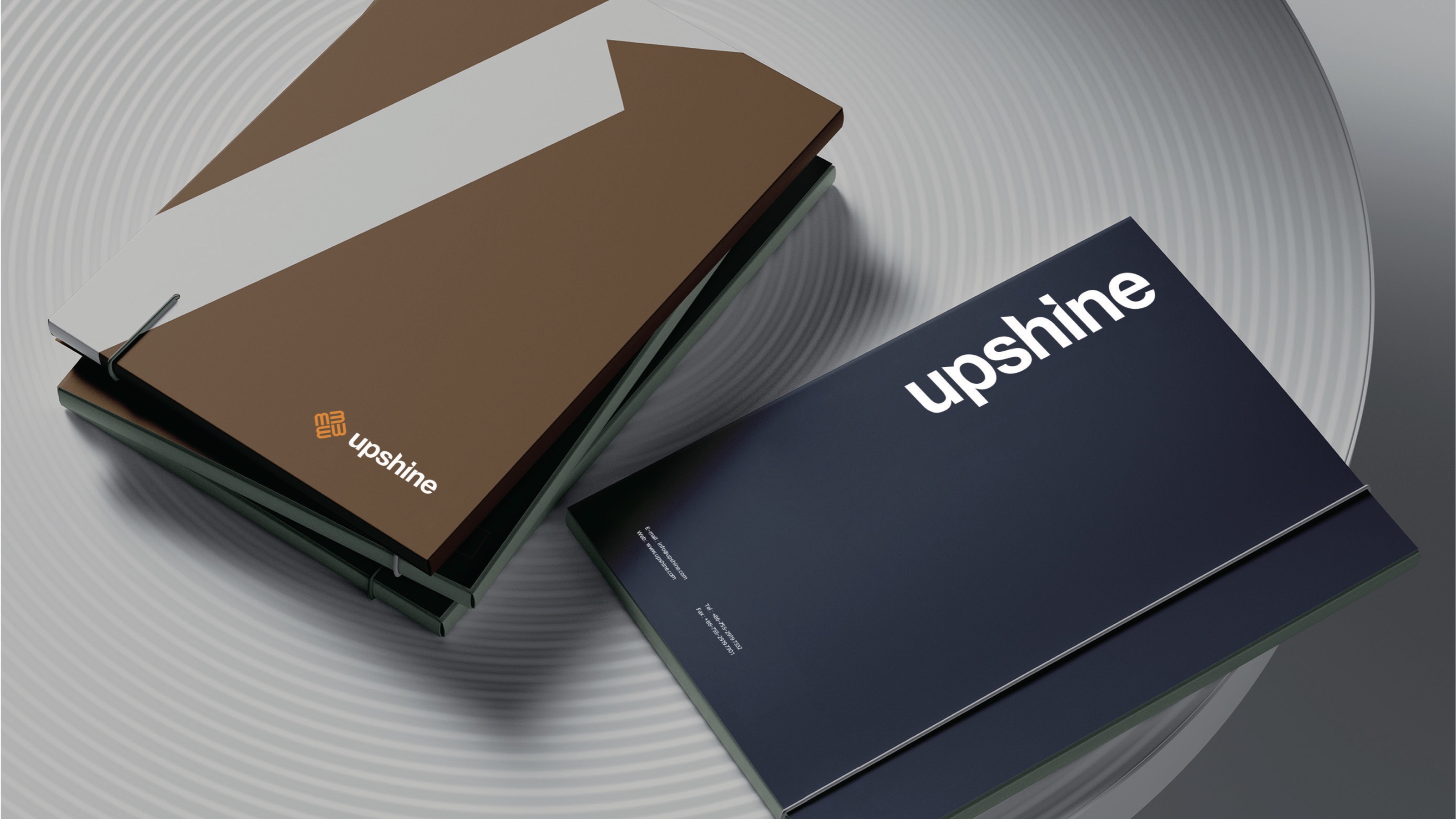
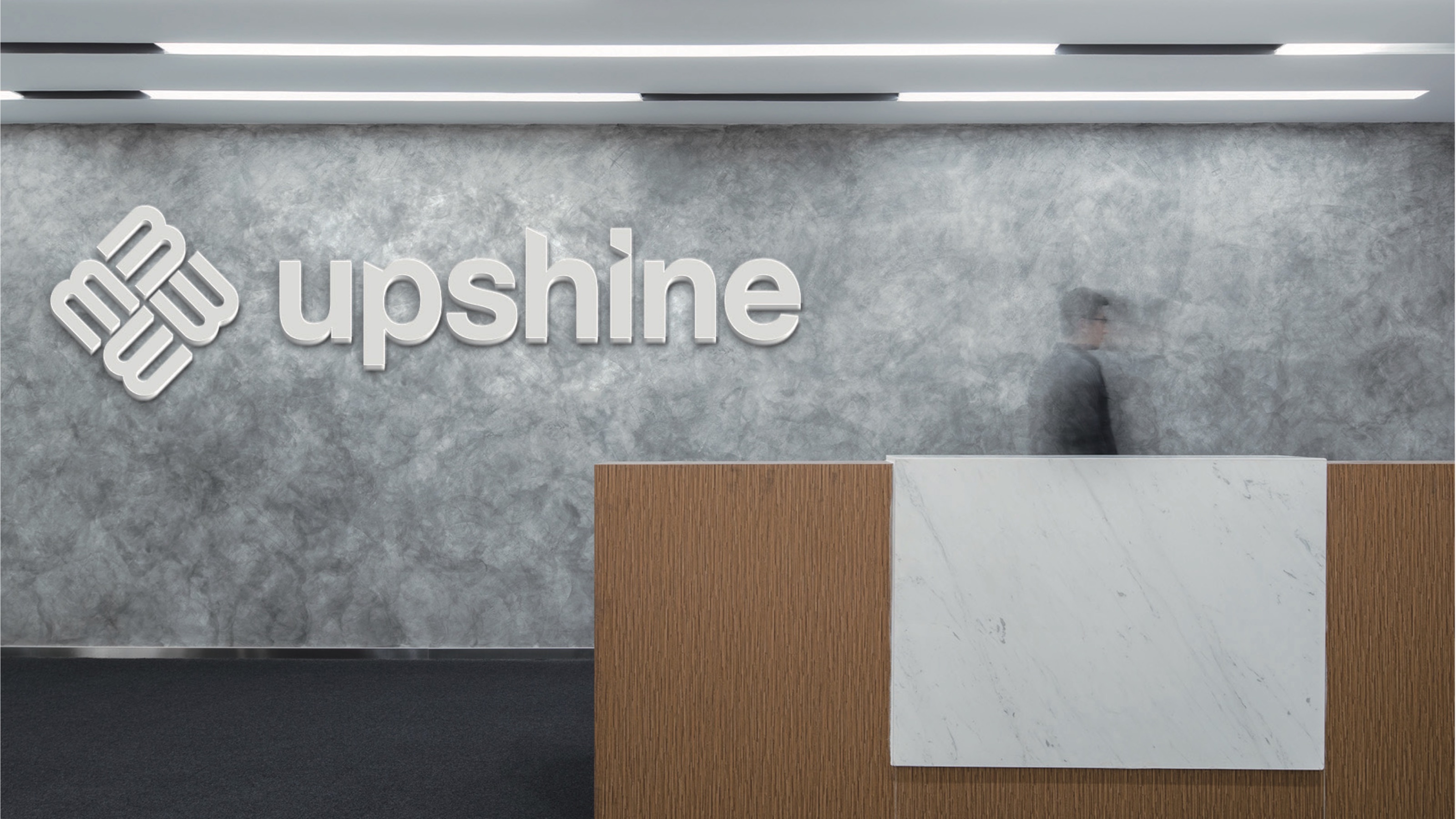
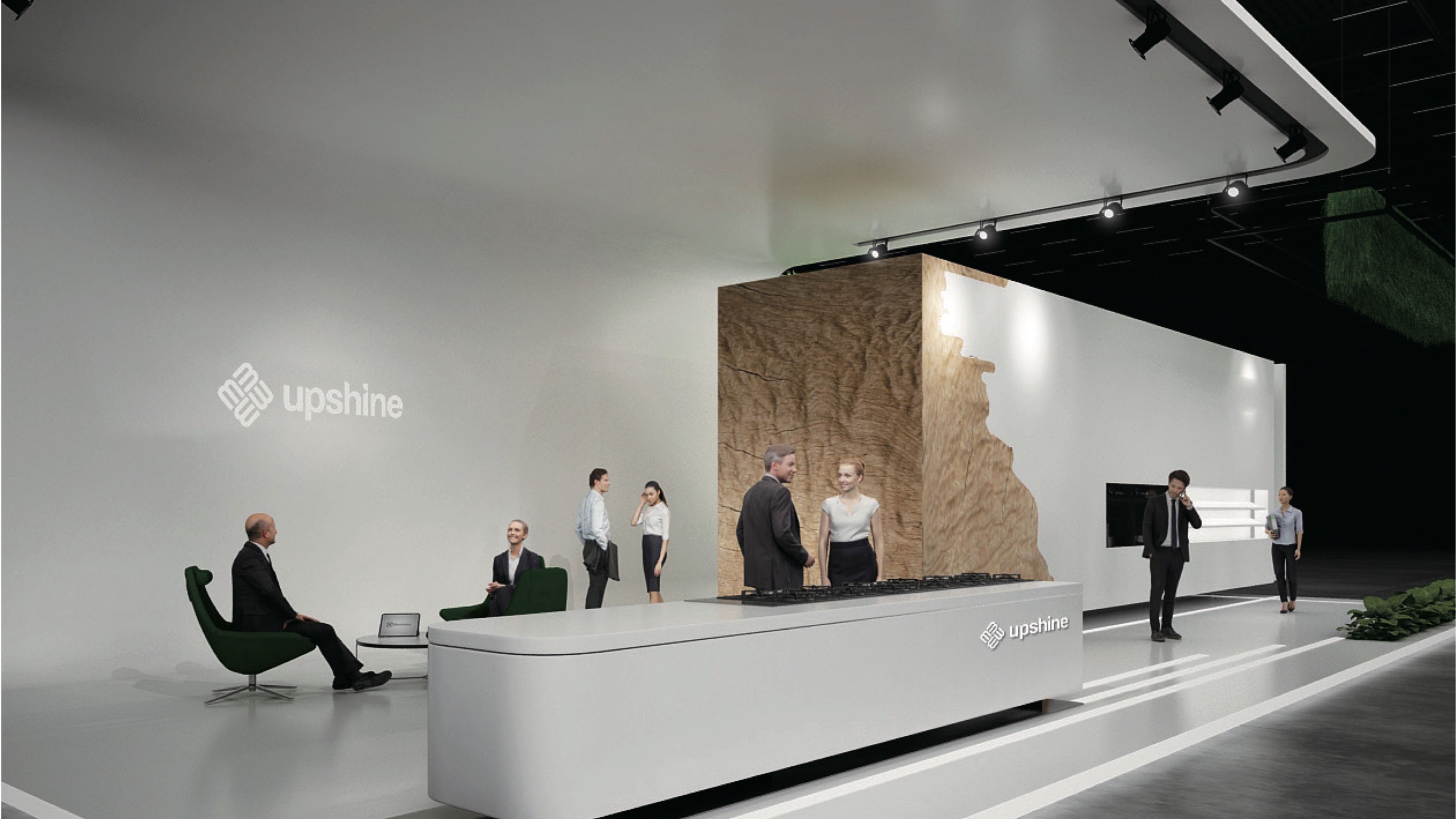
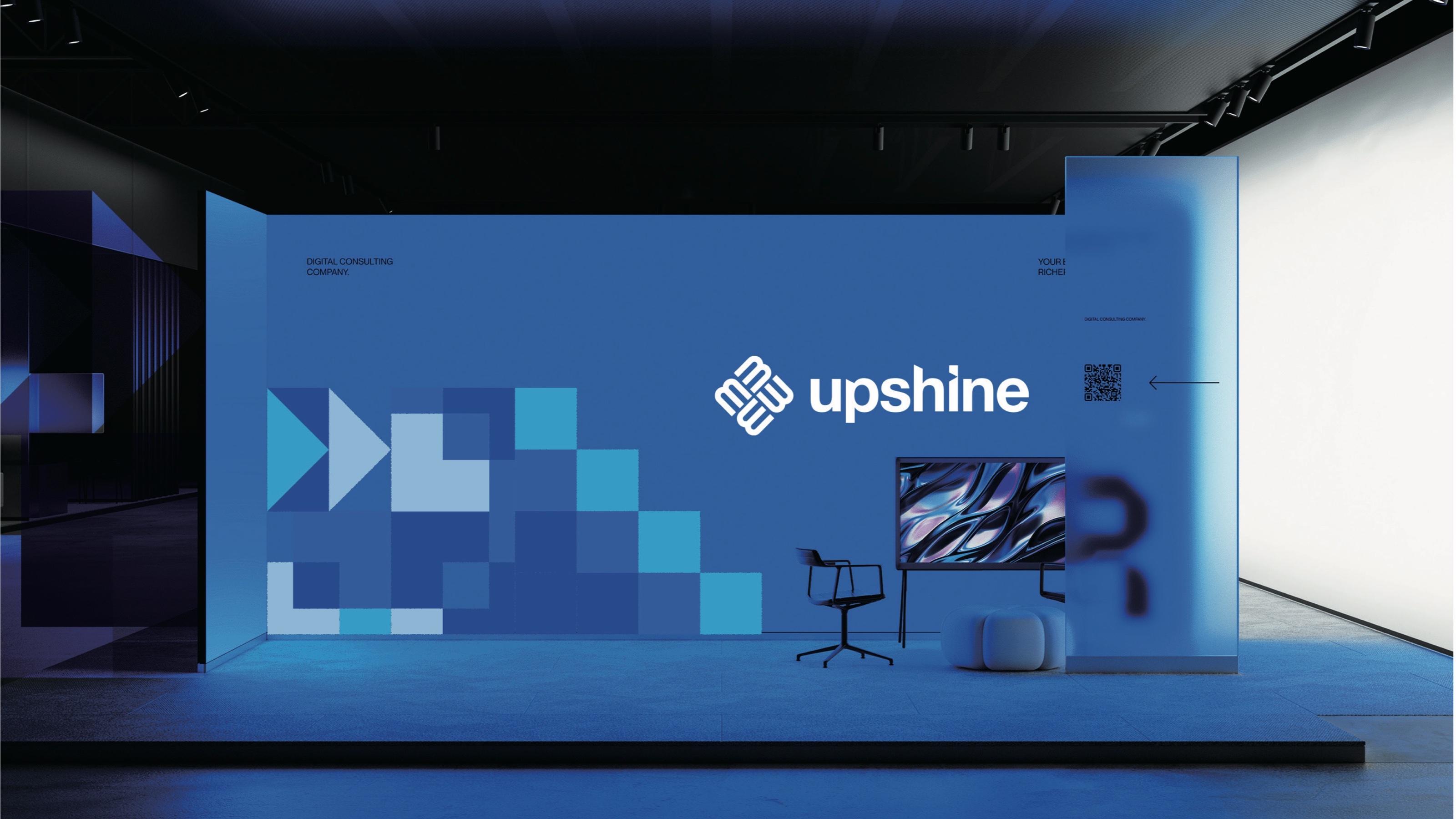
Upshine
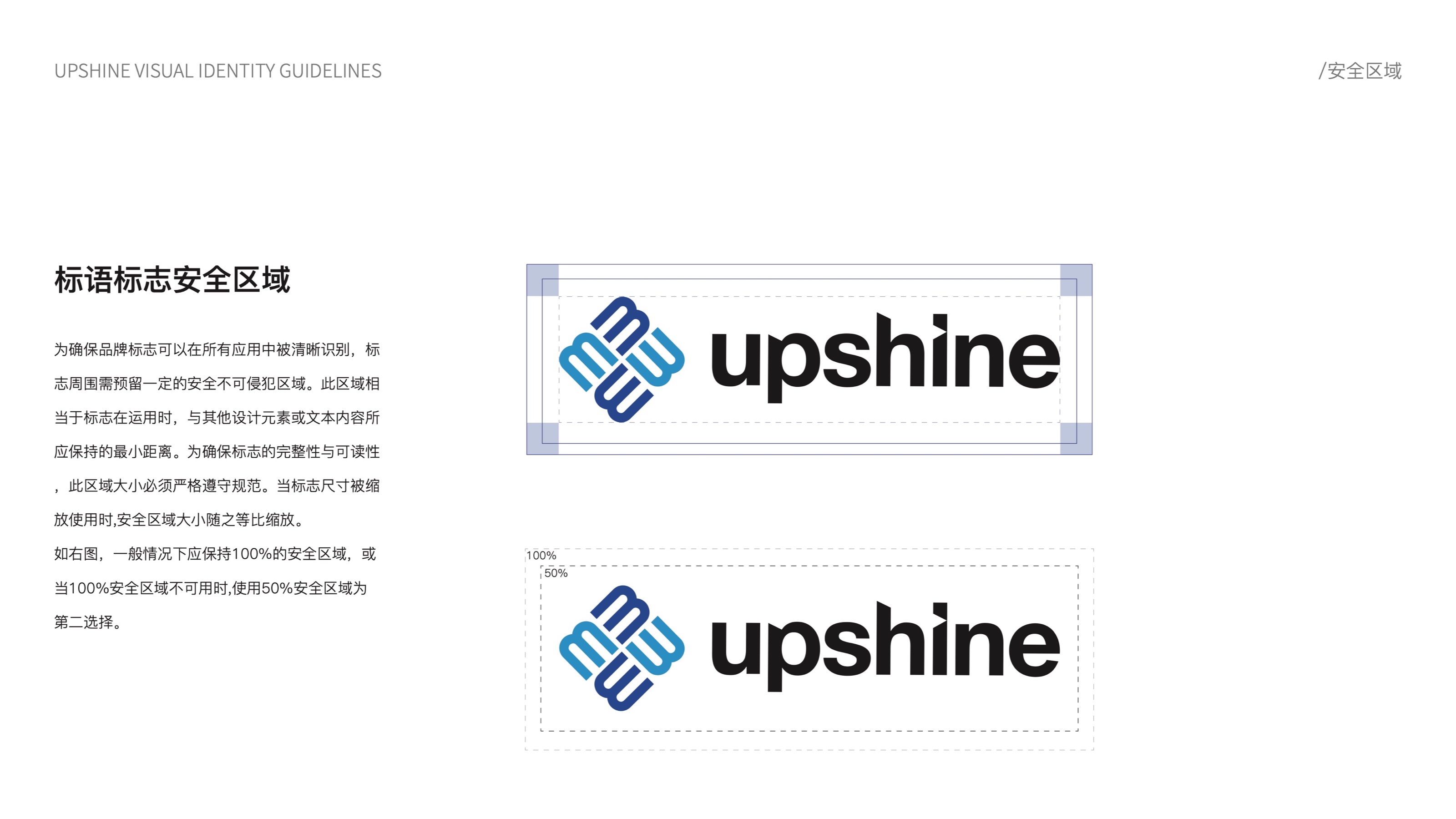
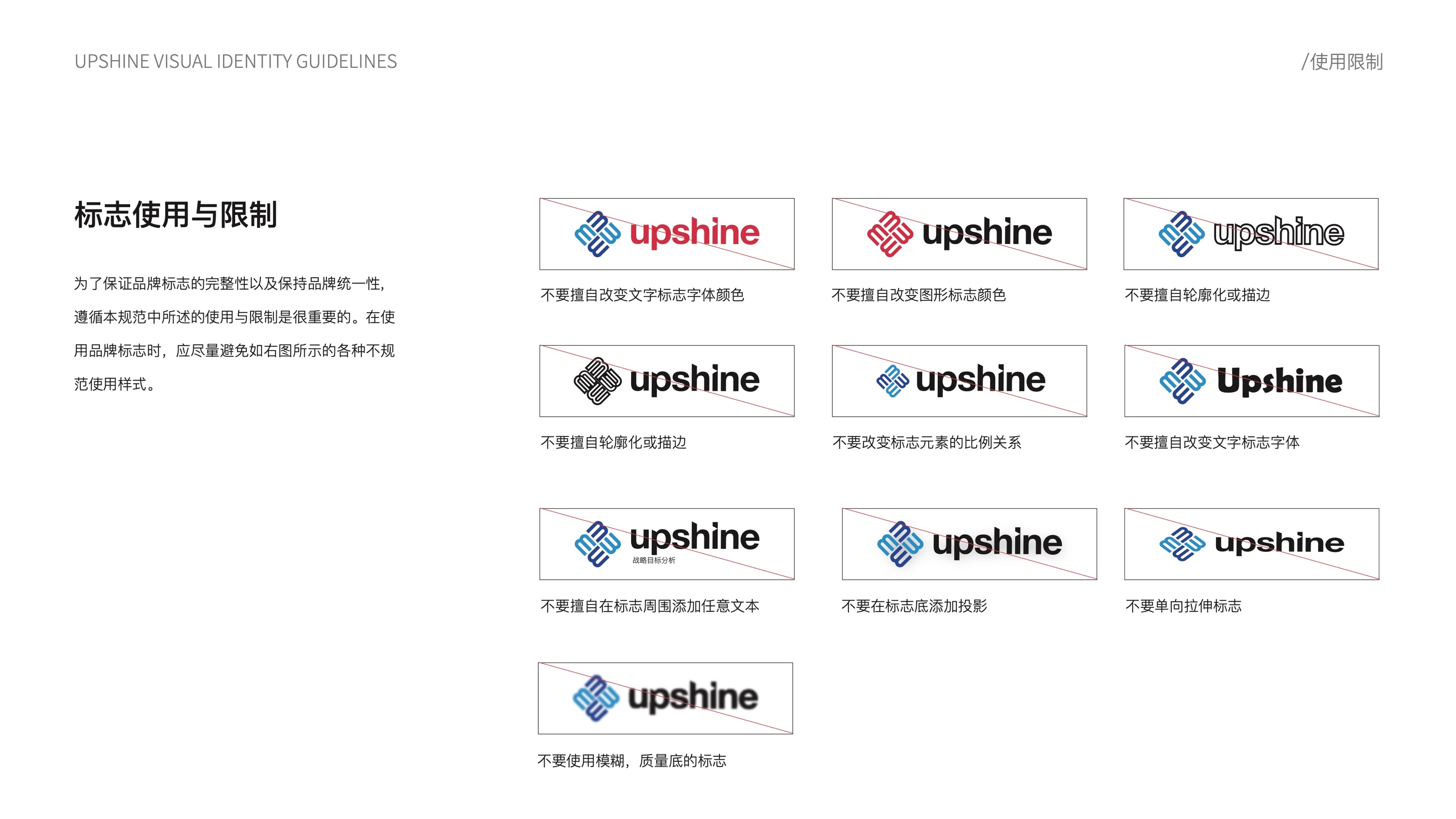
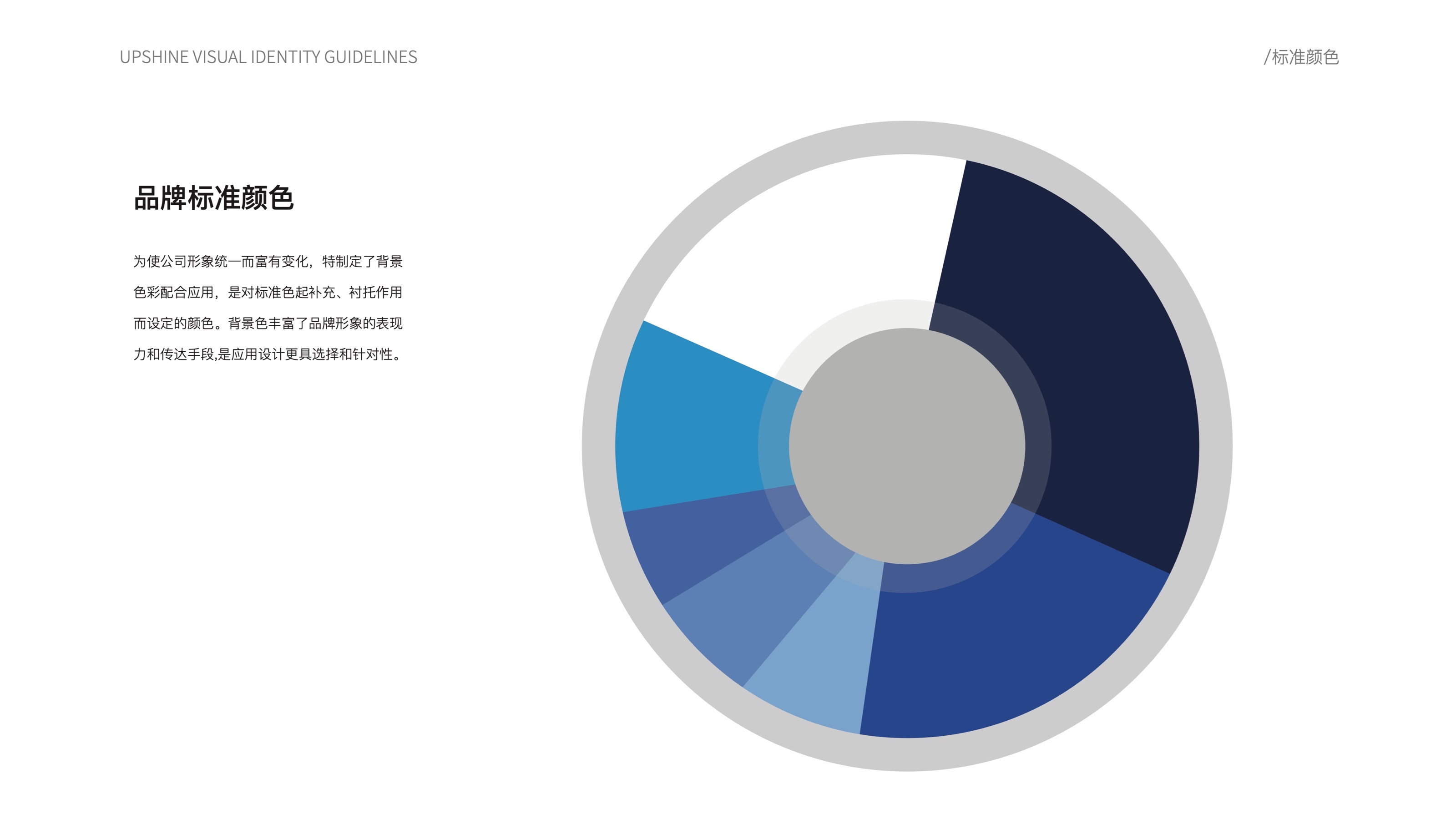
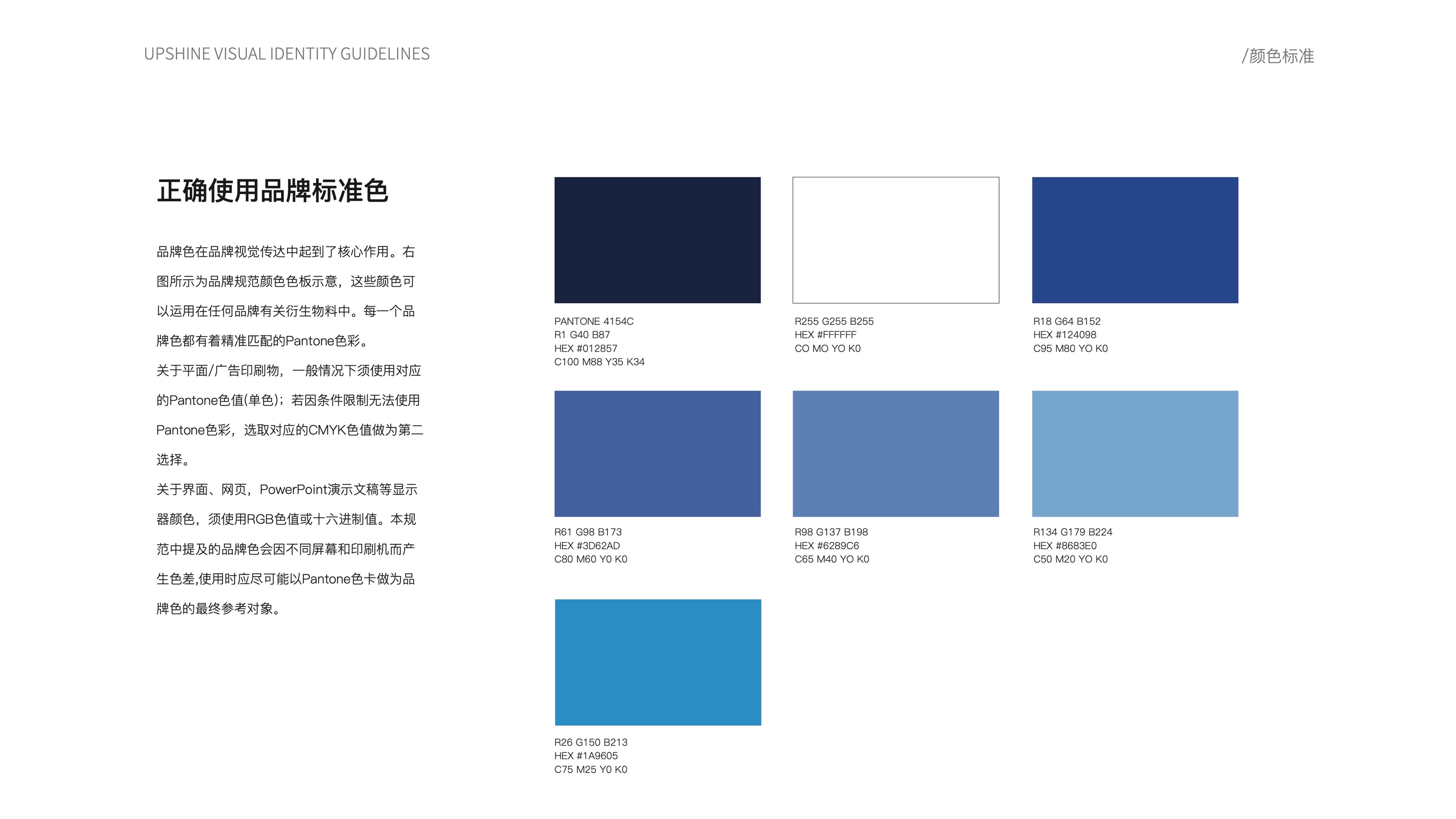
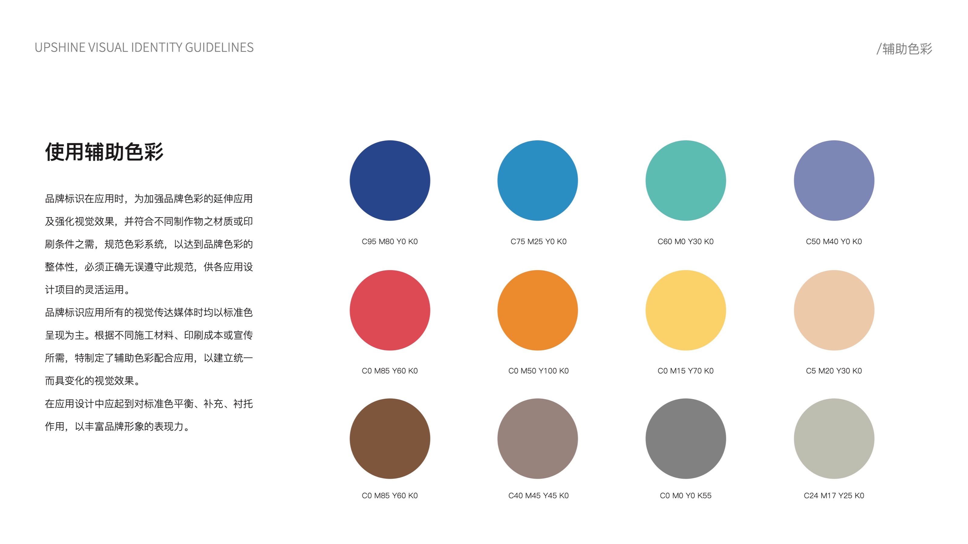
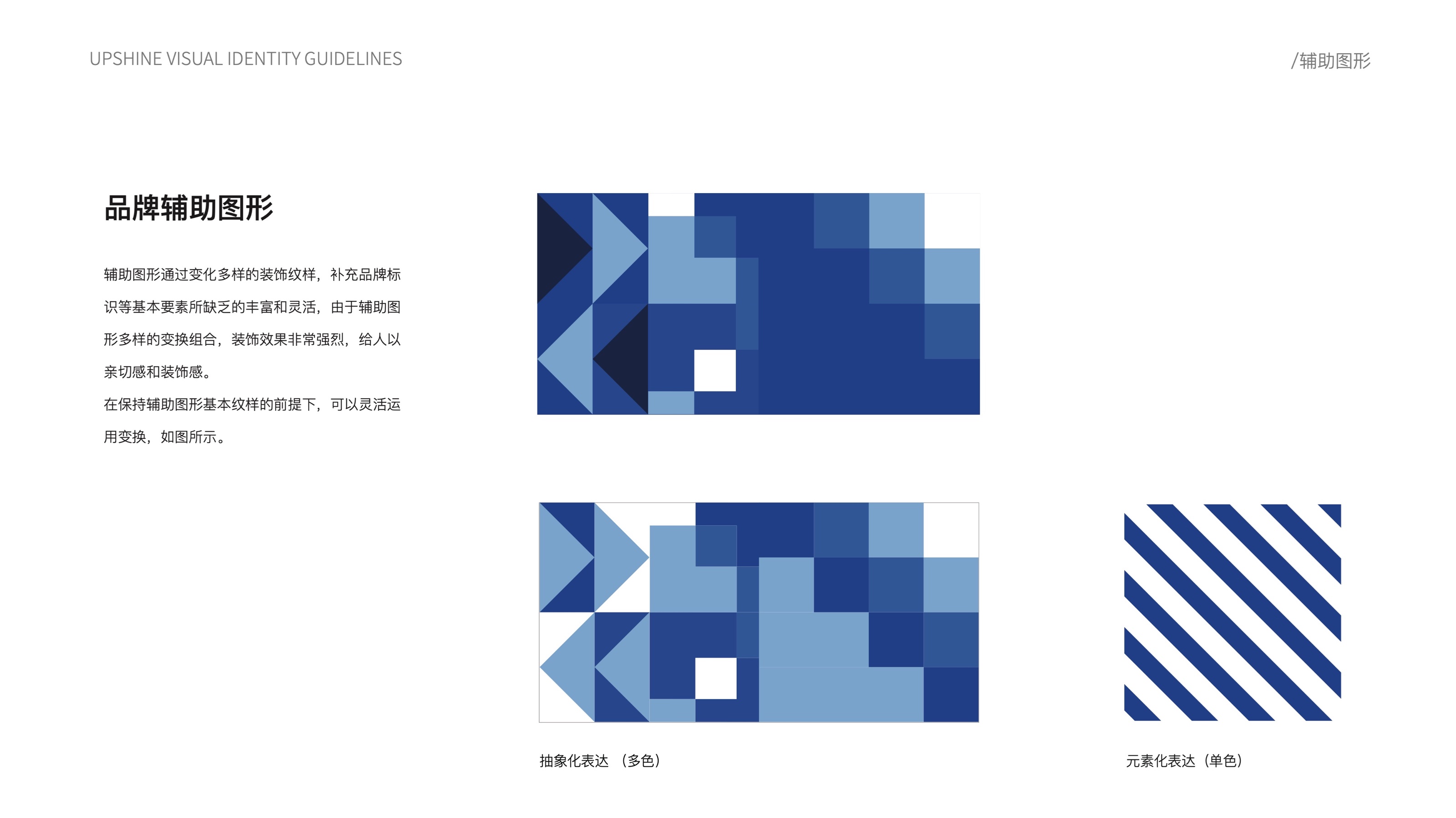
"A complete visual identity guideline for a lighting brand."
02VI guidelines
logo · color · application
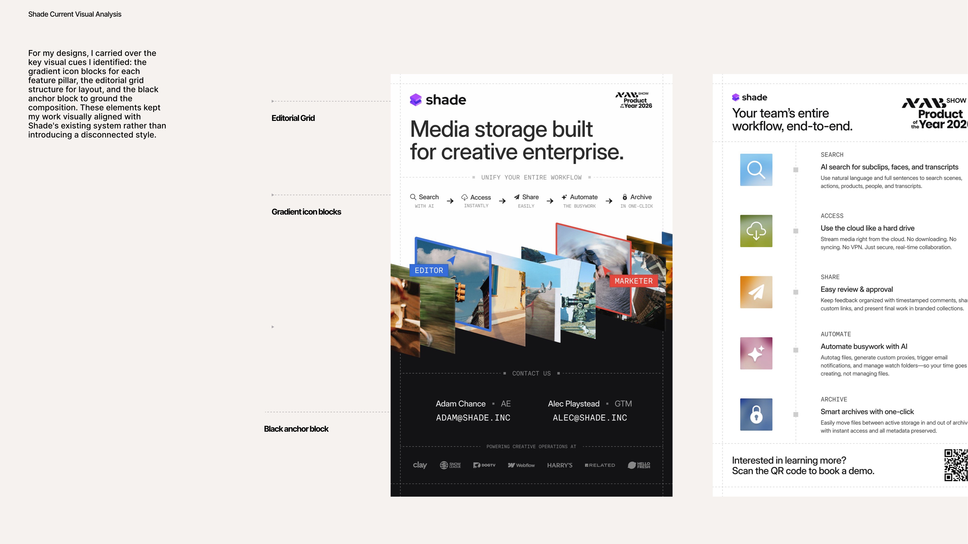
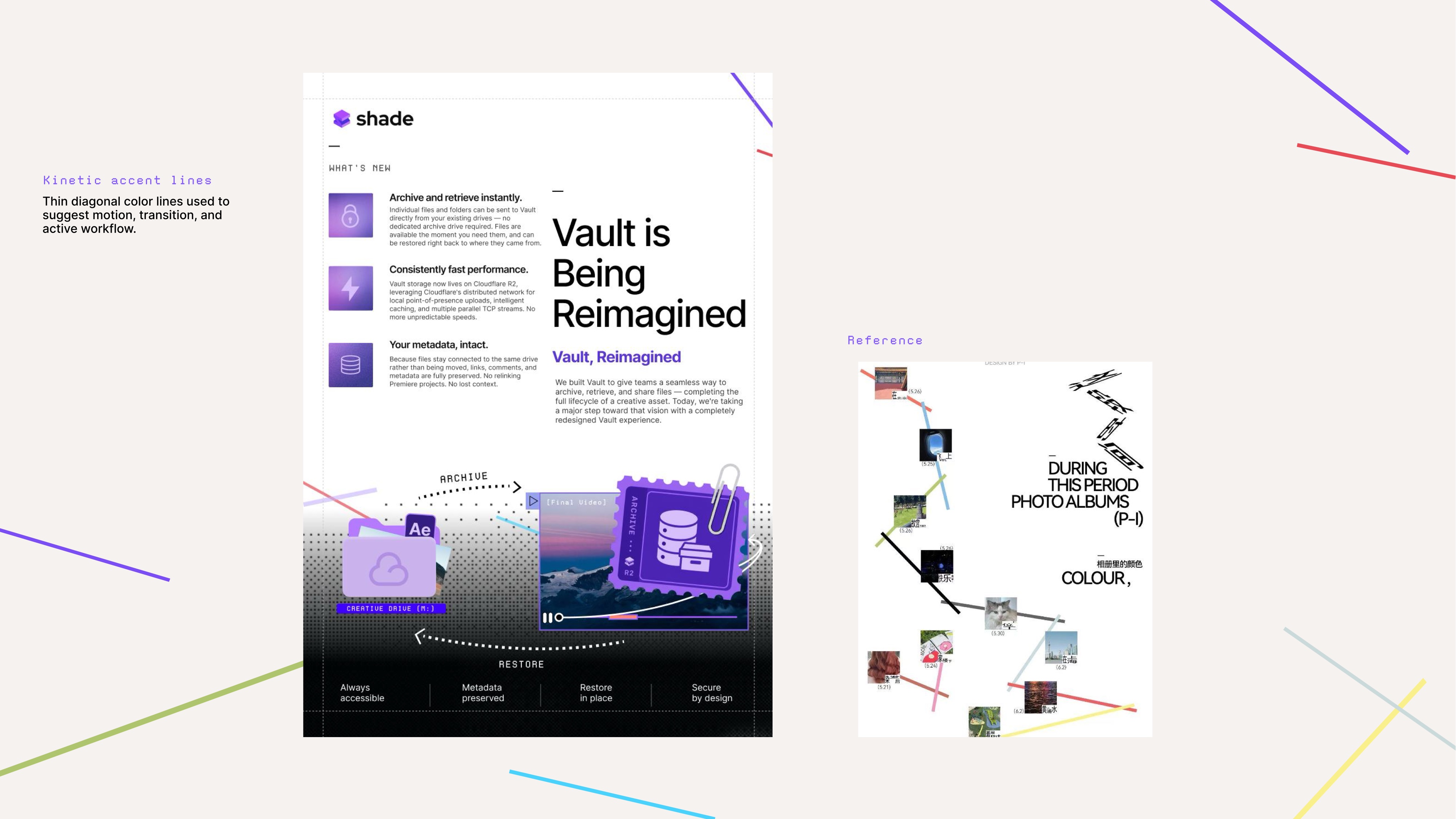
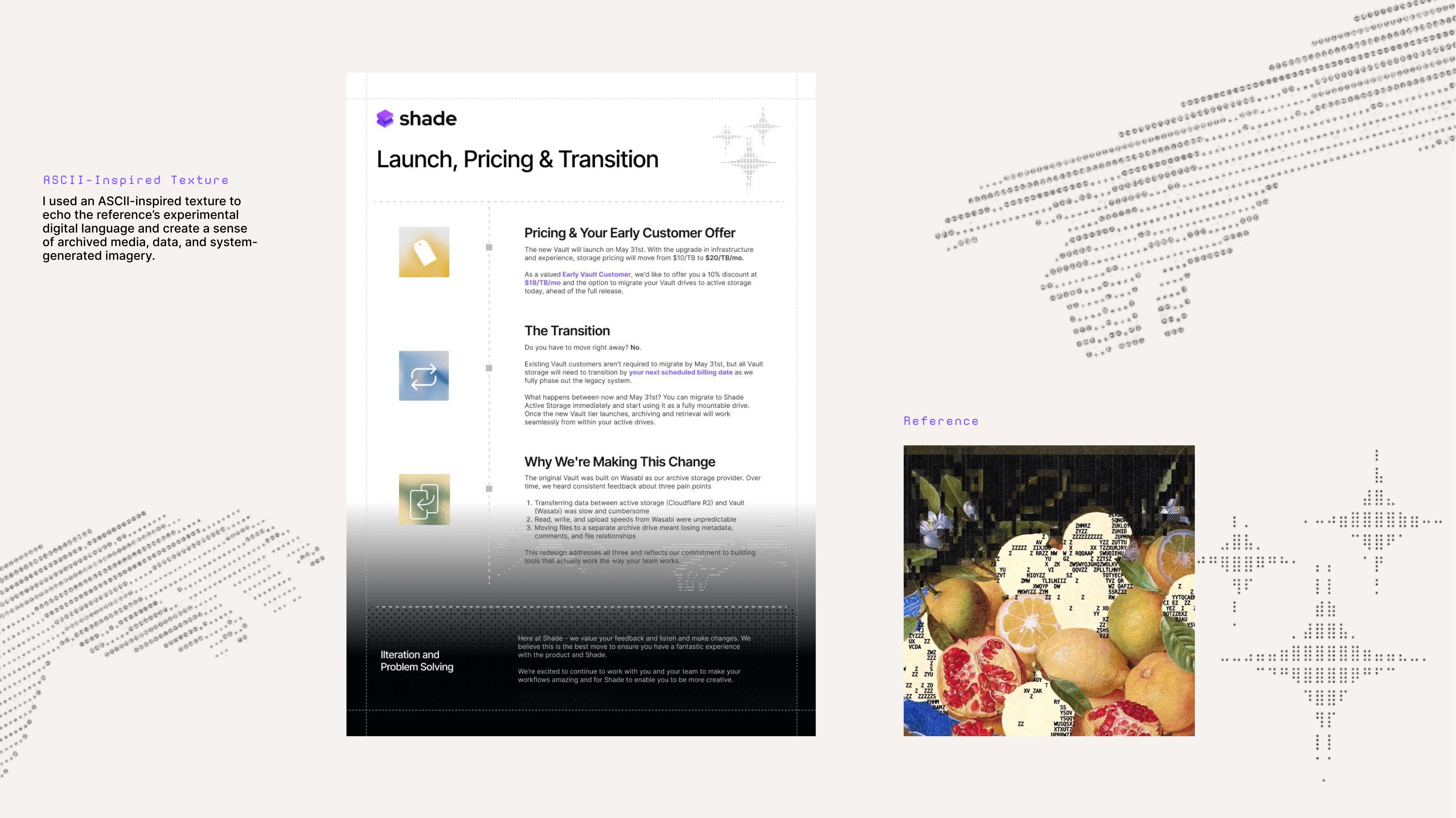
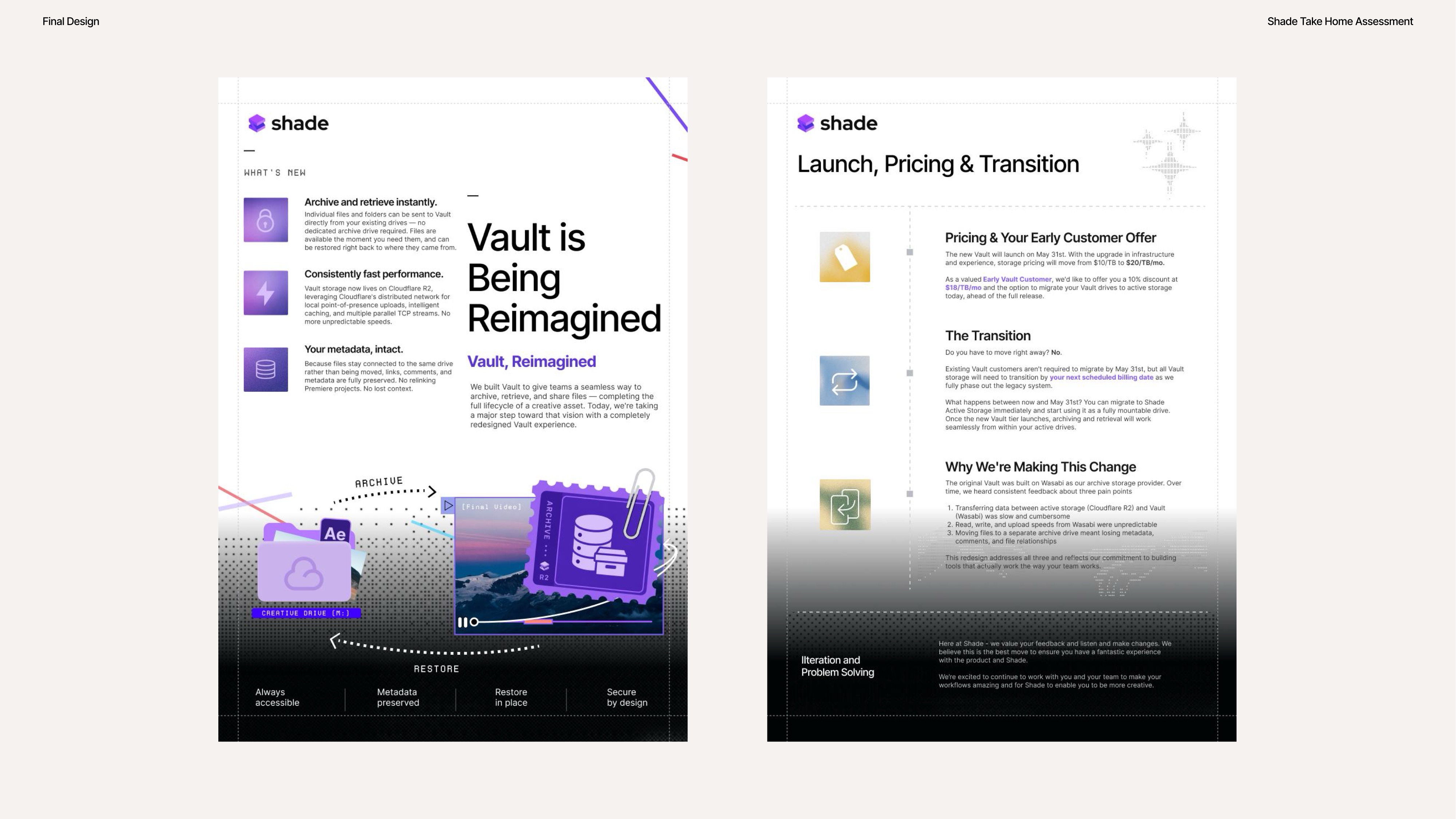
Shade
"A brand identity built from scratch — process, rationale, and system."
03Brand system
process + rationale
Projects / Crebit
Crebit

Making financial infrastructure feel immediate, trusted, and easy to explain.

A fintech brand system for students and families moving money across borders. Identity, campaign graphics, product surfaces, and motion design — built as one system.

01Trust-heavy financial identity design
02Social, campaign, and out-of-home translation
03Motion design in Jitter for product moments
Crebit billboard application
Crebit billboard application Crebit mobile screens Crebit palette Crebit campaign assets
1.4   Tone of Voice Version 1.0

Audience: people making a high-stakes financial decision quickly. The visual system had to earn trust before a full product explanation could happen.

How might we make a complex money product feel legible at first glance?

Crebit Brand Identity Guidelines
1.5   Design Choices Version 1.0

The design system uses a strong audience signal, then balances it with the precision expected from a financial product.

The goal was not "make fintech look friendly." It was to make the value understandable before the product became technical.

Color as trust signal

Bright recognition colors create instant memory, while deeper tones give the system enough weight to still feel secure and financial.

Recognition first, credibility always

Type as confidence

Large, plain, direct headlines keep campaign messages legible from a distance and stop the brand from feeling delicate or over-designed.

Bold, useful, quick to read

Campaign as distribution

Feed-native graphics let the brand enter the spaces where people already talk about money, opportunity, risk, and speed.

Designed for attention, held by clarity

Product copy as anxiety reduction

Inside the app, language becomes calmer and more precise: fees, exchange rates, status, and transfer timing must be impossible to misread.

Tone shifts, trust stays
Crebit Brand Identity Guidelines
1.6   Key Messaging Version 1.0
Pay abroad.
Send home.
Grow anywhere.
Crebit Brand Identity Guidelines
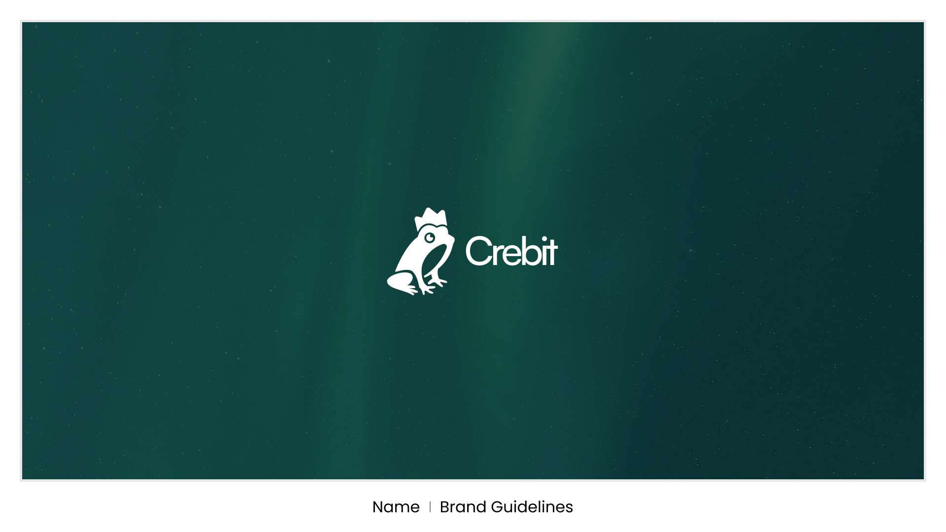
Crebit brand cover
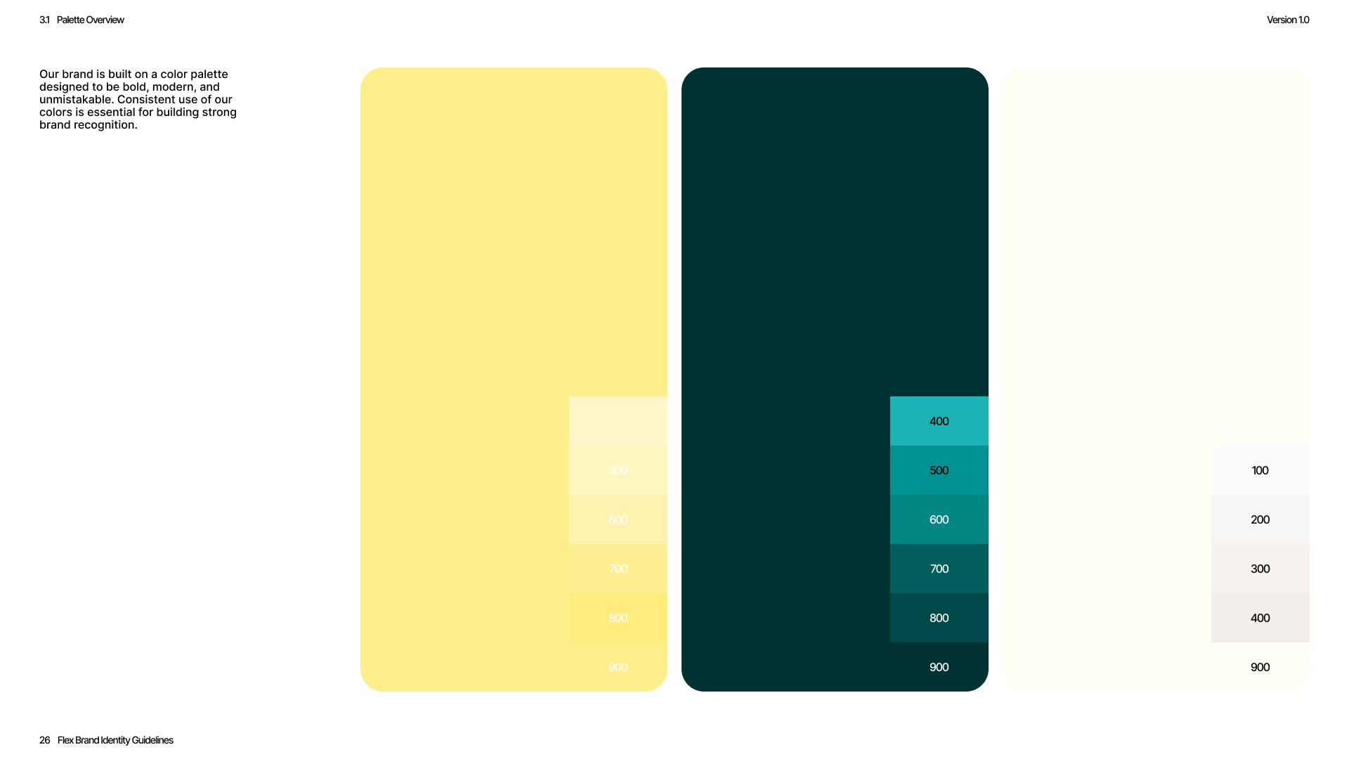
Crebit color palette
Crebit brand asset
Crebit brand asset
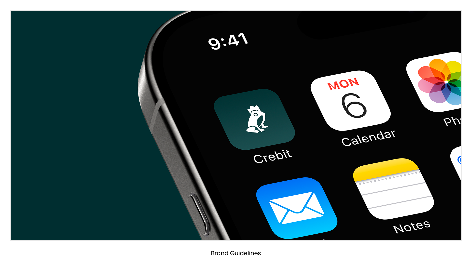
Crebit app icon
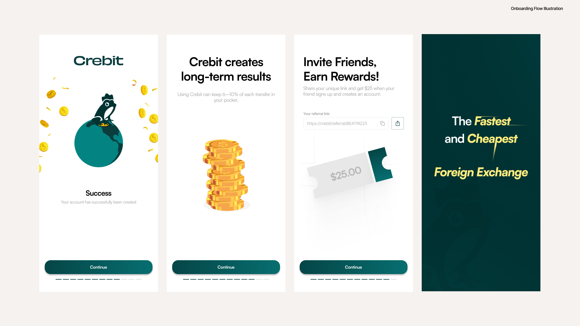
Crebit mobile screens

Motion Design

Jitter

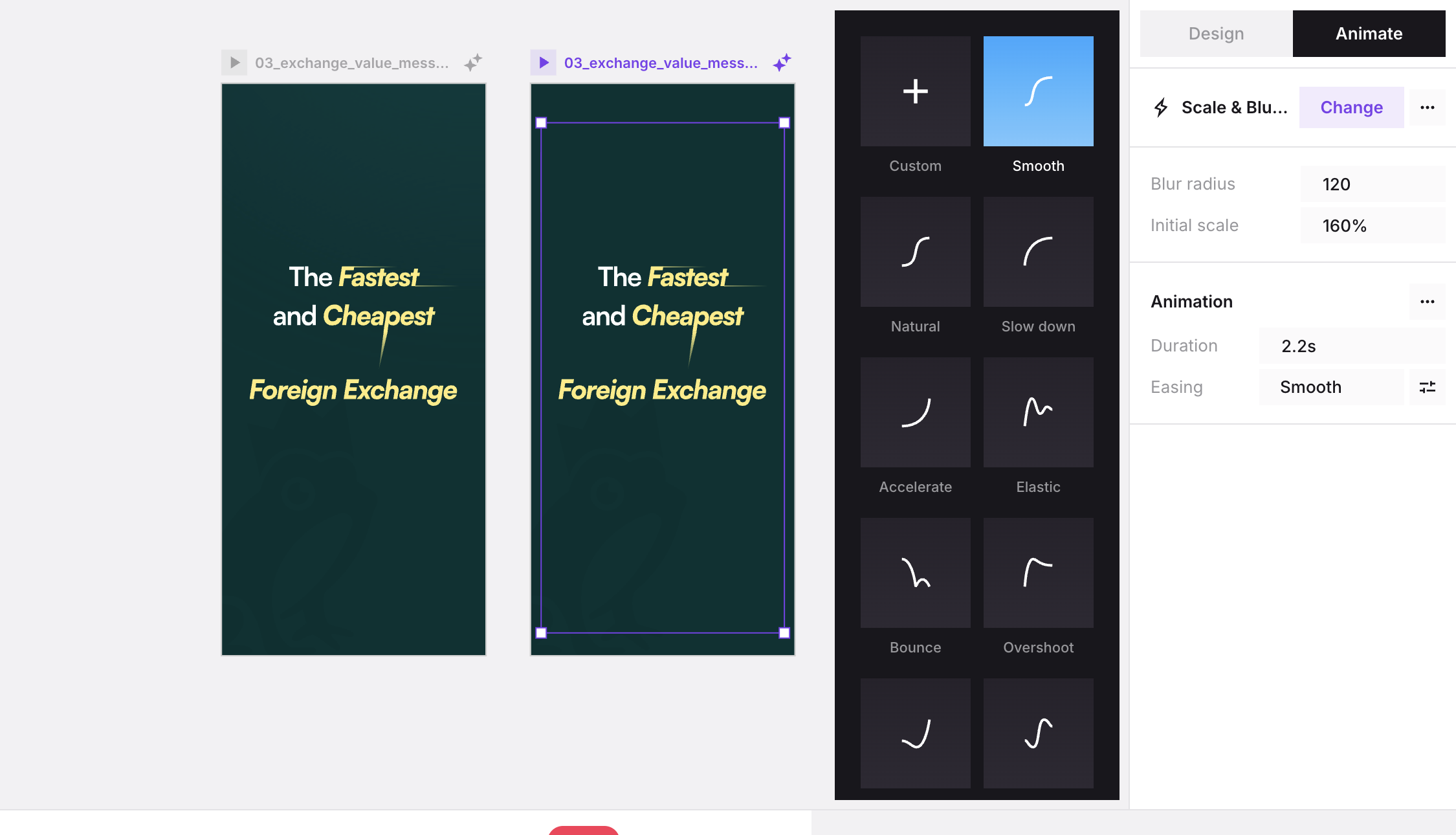
Crebit success account created motion
Crebit invite friends rewards motion
Crebit exchange value message motion

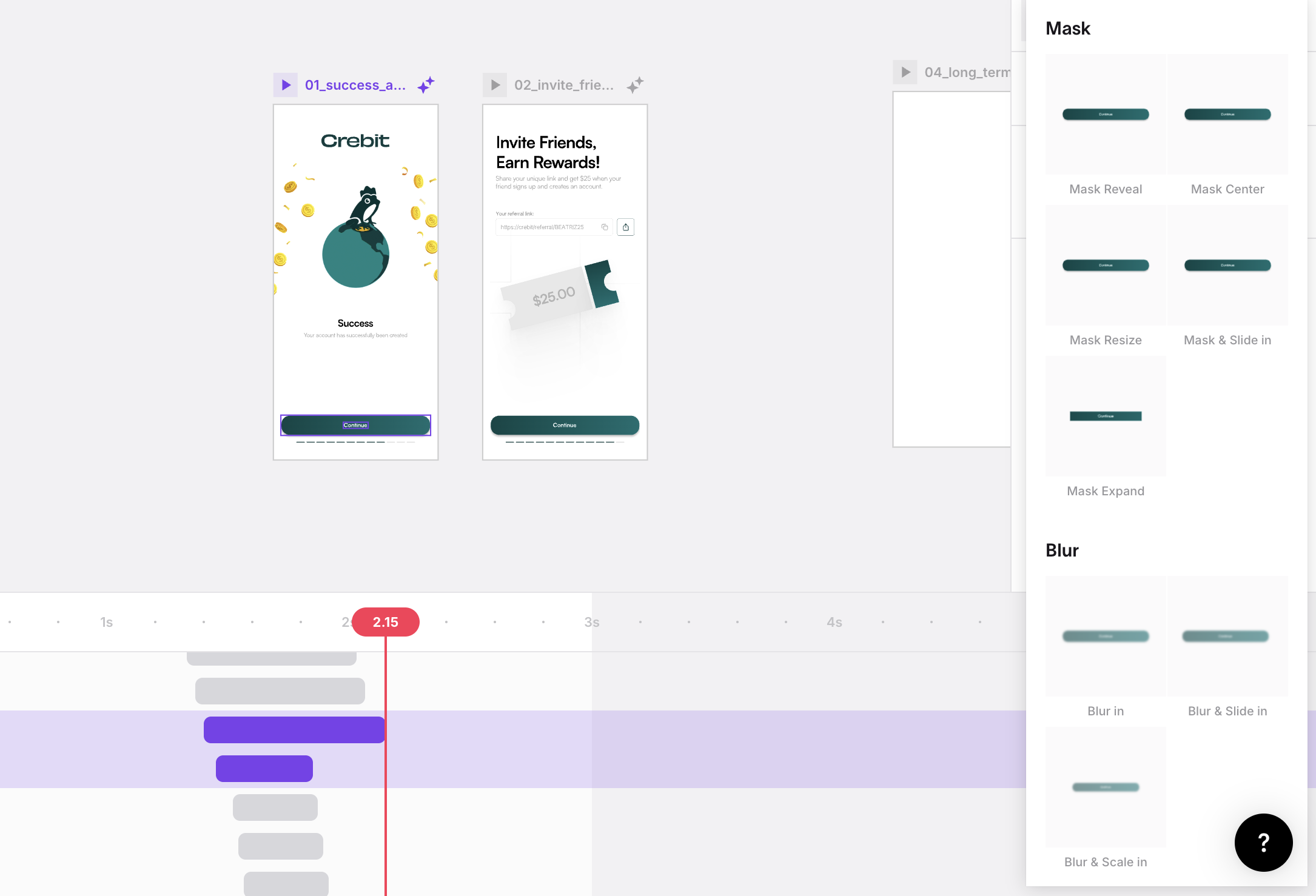
Motion Workflow · Jitter

I design motion as a way to make product value faster to understand.

01

Build vectors in Figma

Separate illustration layers so each motion moment has a clean role.

02

Stage in Jitter

Import frames, group layers, define masks, and set the timeline.

03

Tune behavior

Use timing, easing, and reveal speed to match the product emotion.

04

Export for use

Ship loopable GIF / MP4 assets for onboarding, social, and product moments.
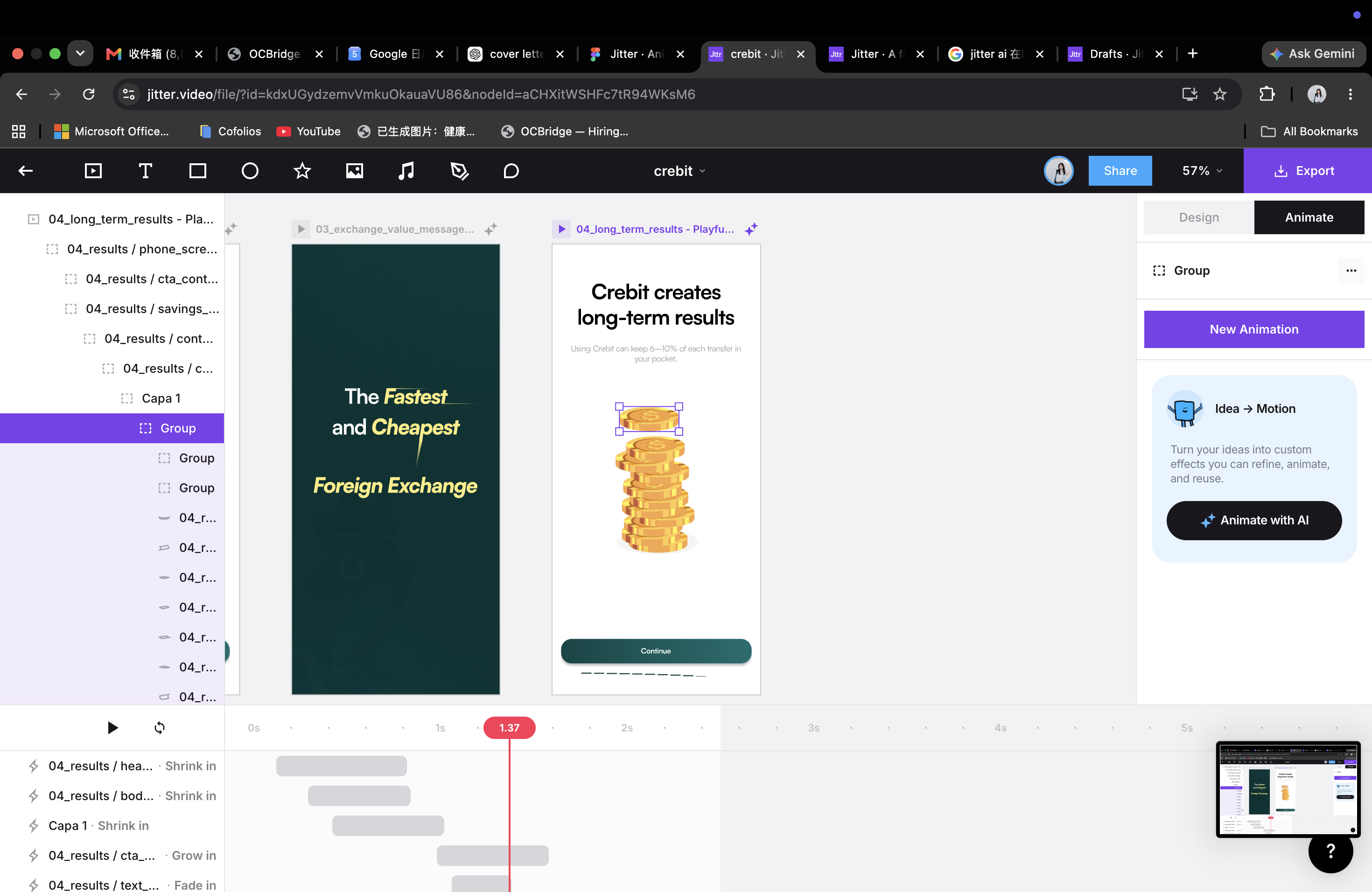
Crebit vector illustration setup in Figma Figma vector setup
Crebit motion timeline in Jitter Jitter timeline
Crebit Jitter layer handoff Export handoff
Crebit billboard
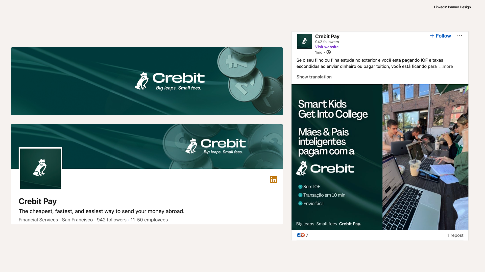
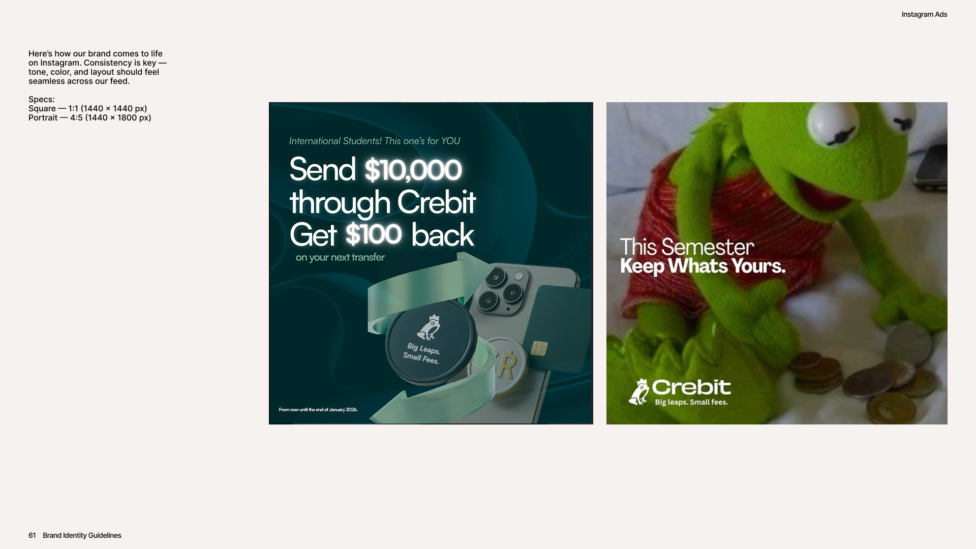
Crebit social assets
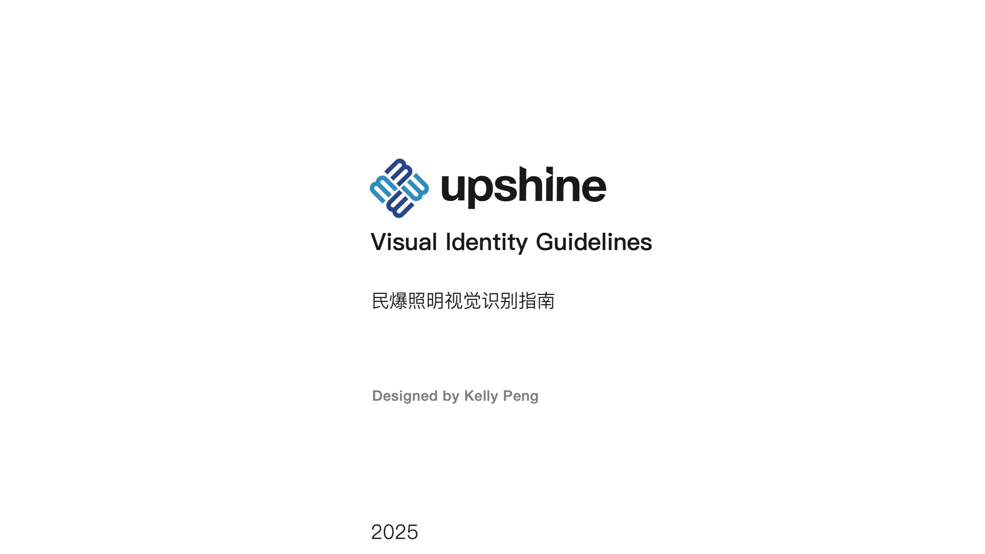
Upshine VI page 1
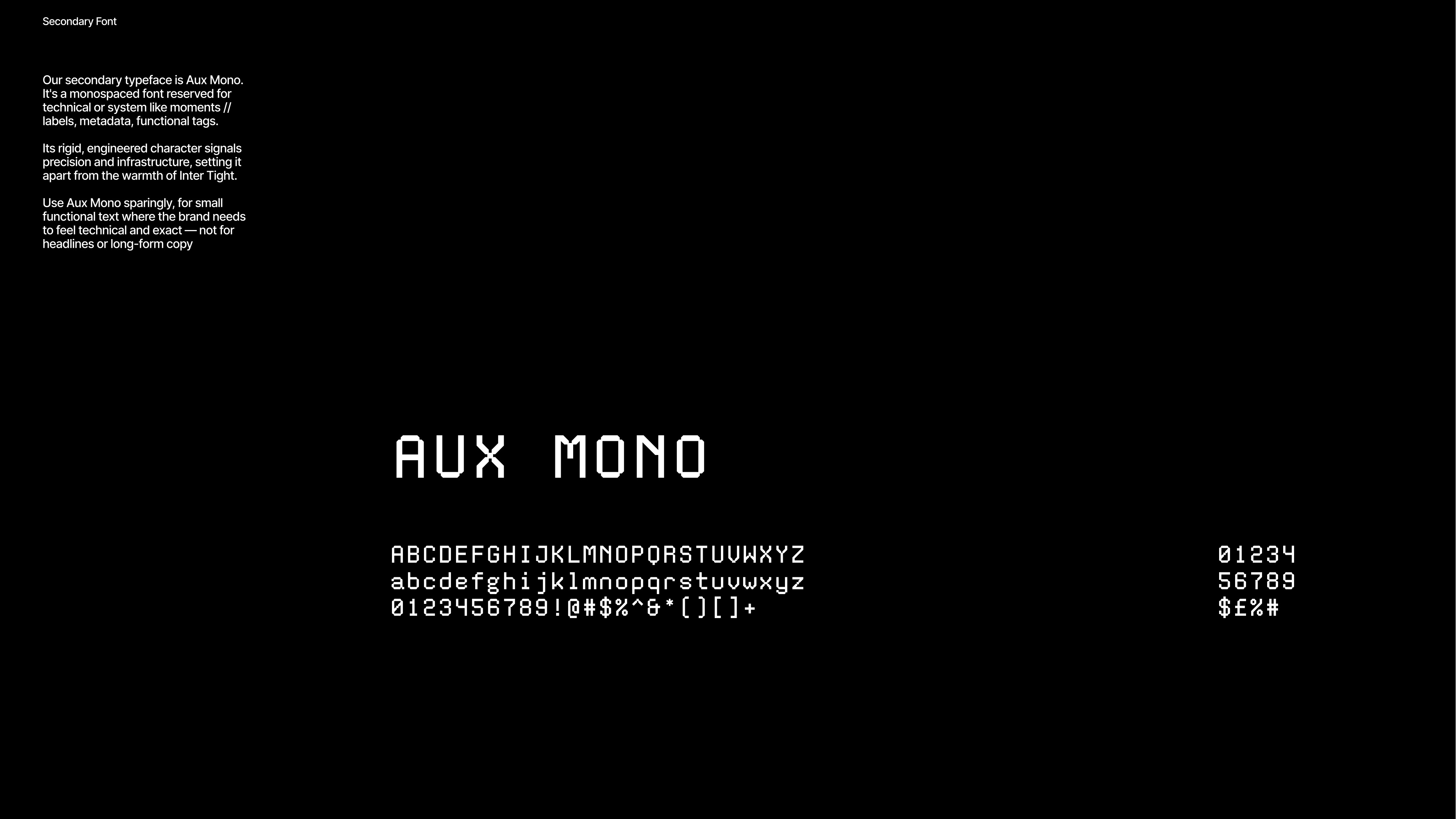
Upshine VI page 2
Upshine VI page 3
Upshine VI page 4
Upshine VI page 5
Upshine VI page 6
Upshine VI page 7
Upshine VI page 8
Upshine VI page 9
Upshine VI page 10
Upshine VI page 11
Upshine VI page 12
Upshine VI page 13
Upshine VI page 14
Upshine VI page 15
Upshine VI page 16
Upshine VI page 17
Upshine VI page 18
Upshine VI page 19
Upshine VI page 20
Upshine VI page 21
Upshine VI page 22
Upshine VI page 23
Upshine VI page 24
Upshine VI page 25
Upshine VI page 26
Upshine VI page 27
Upshine VI page 28
Upshine VI page 29
Upshine VI page 30
Upshine VI page 31
Upshine VI page 32
Upshine VI page 33
Upshine VI page 34
Upshine VI page 35
Upshine VI page 36
Upshine VI page 37
Upshine VI page 38
Upshine VI page 39
Upshine VI page 40
Upshine VI page 41
Upshine VI page 42
Upshine VI page 43
Upshine VI page 44
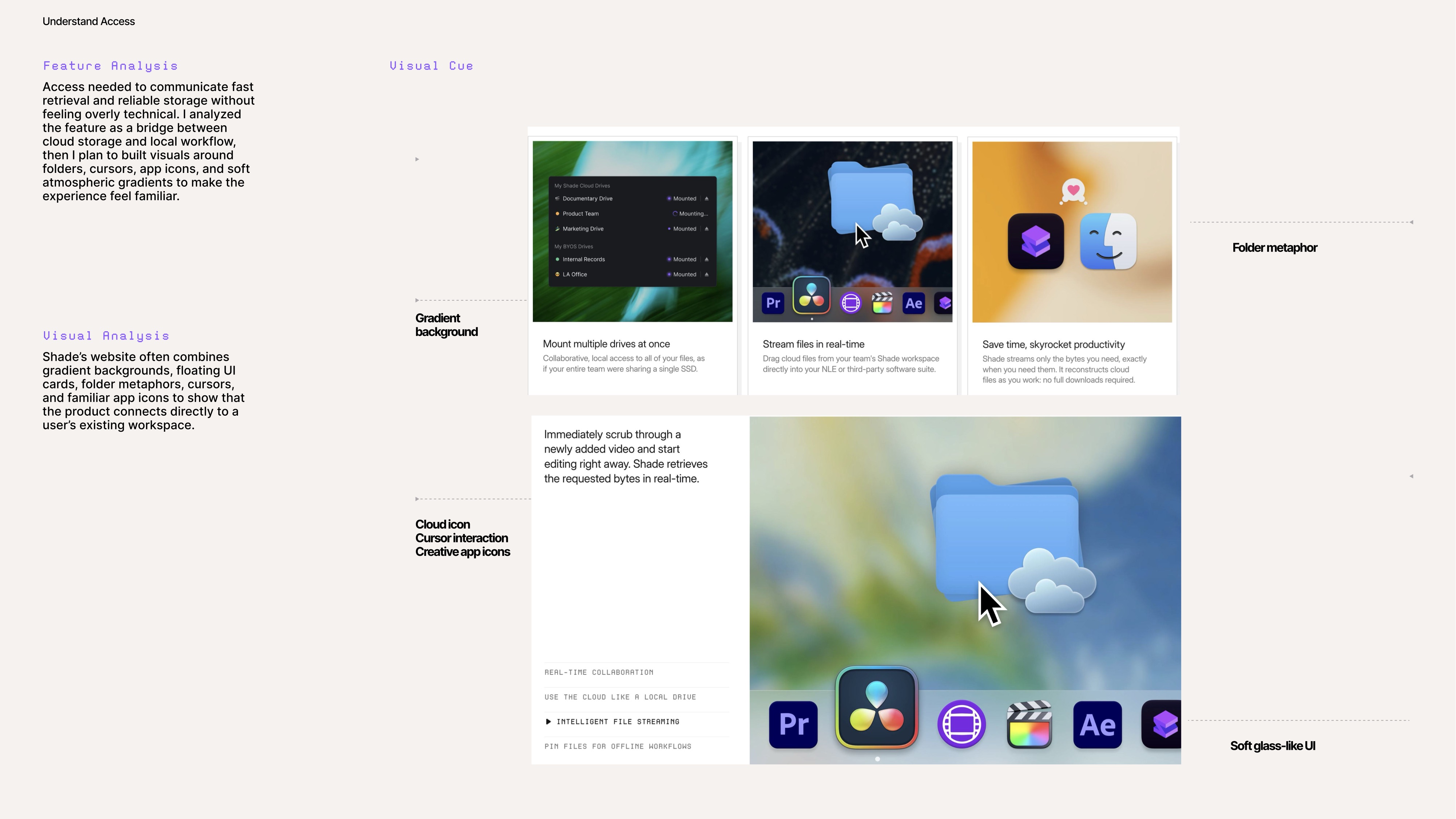
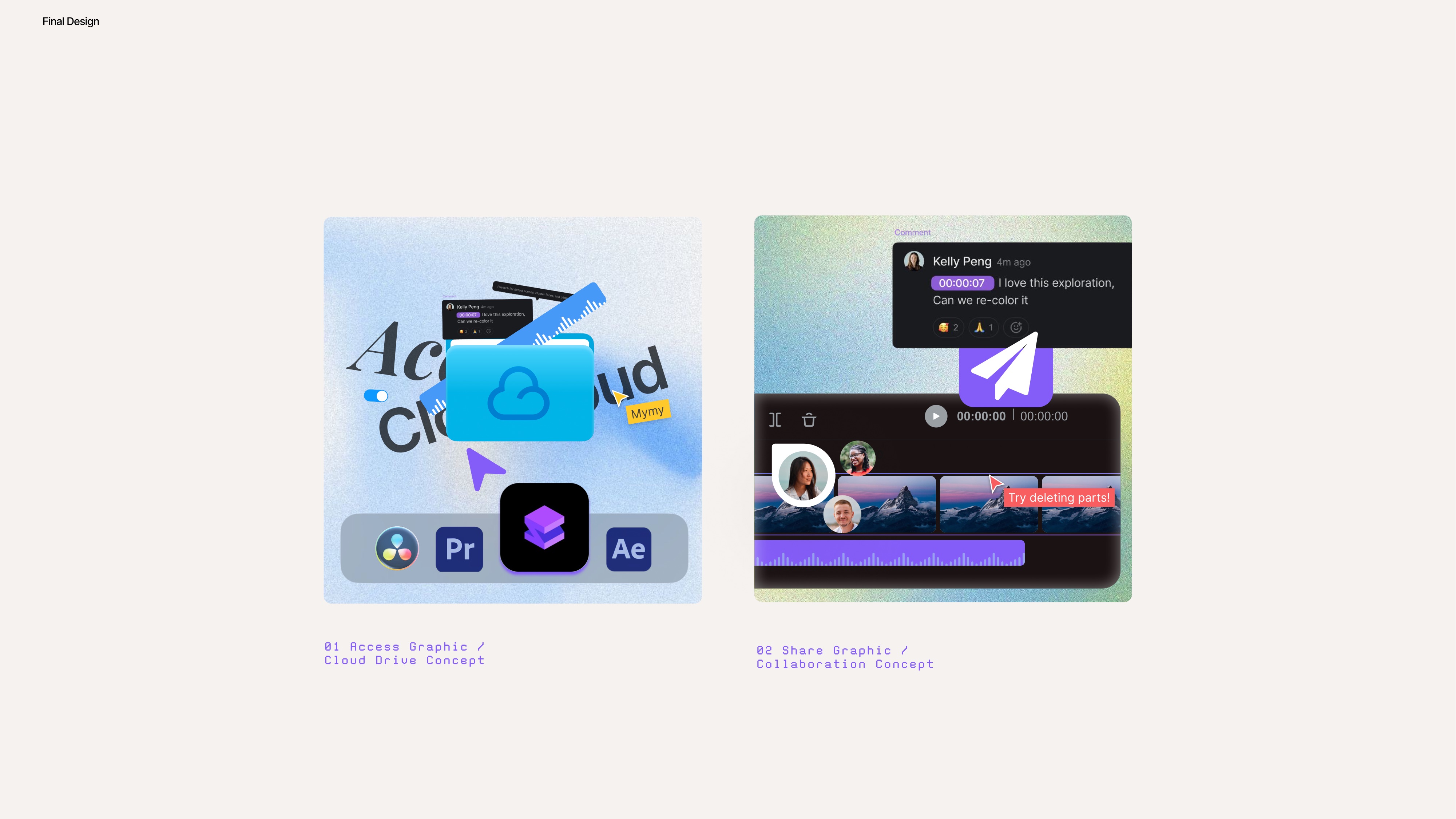
Shade page 1
Shade page 2
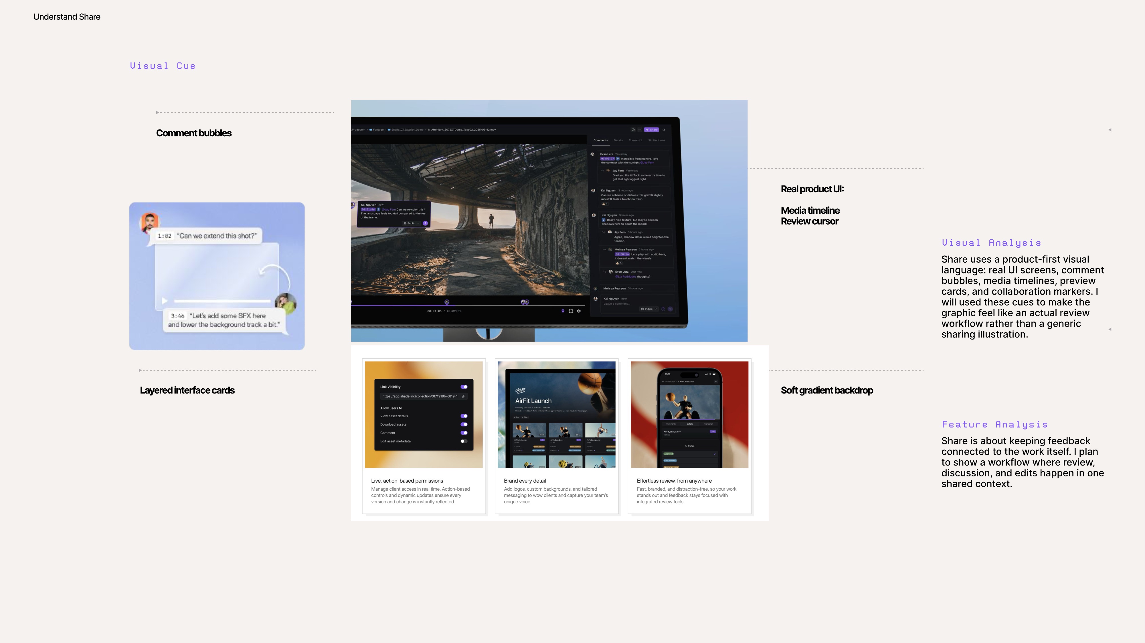
Shade page 3
Shade page 4
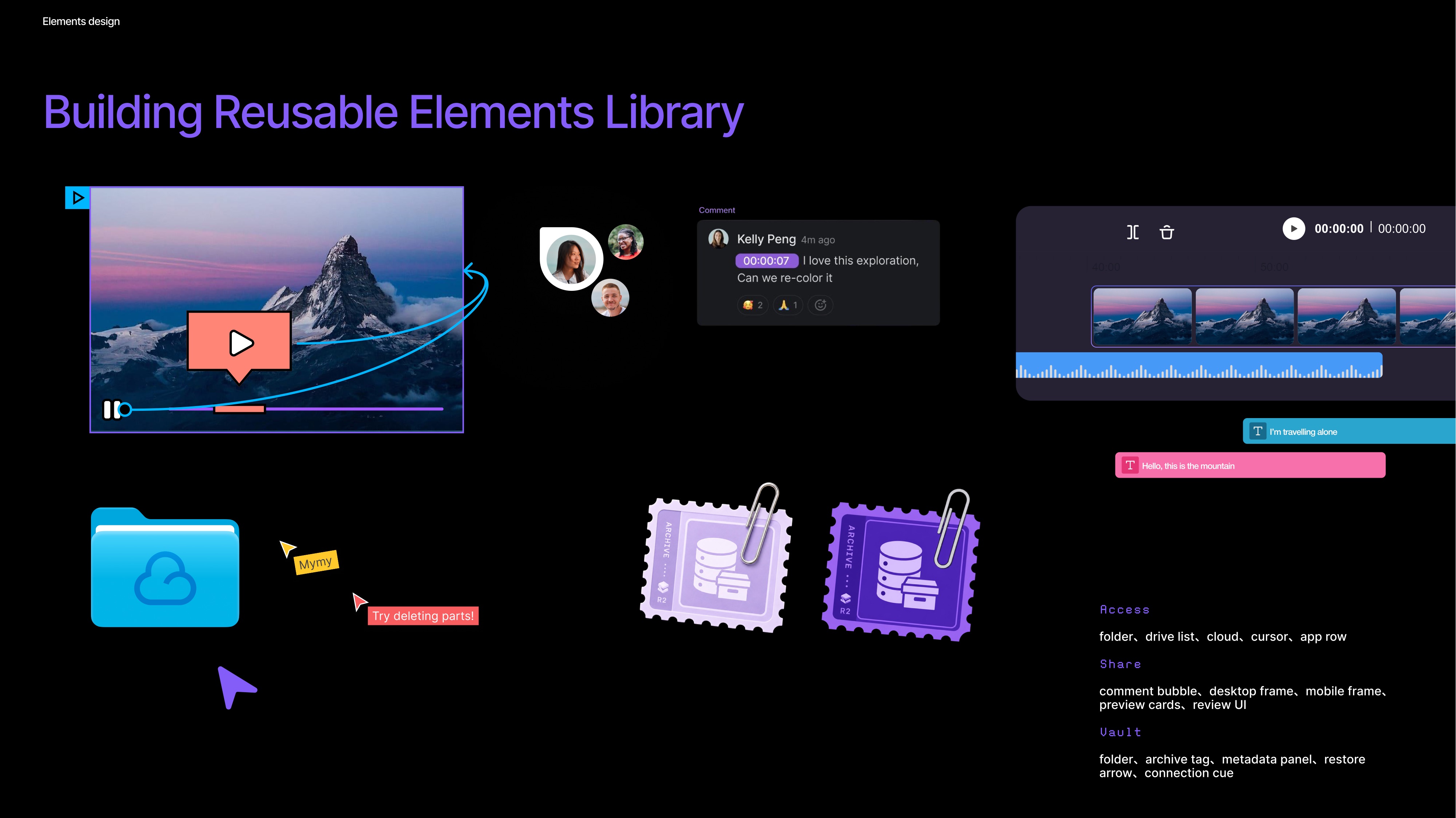
Shade page 5
Shade page 6
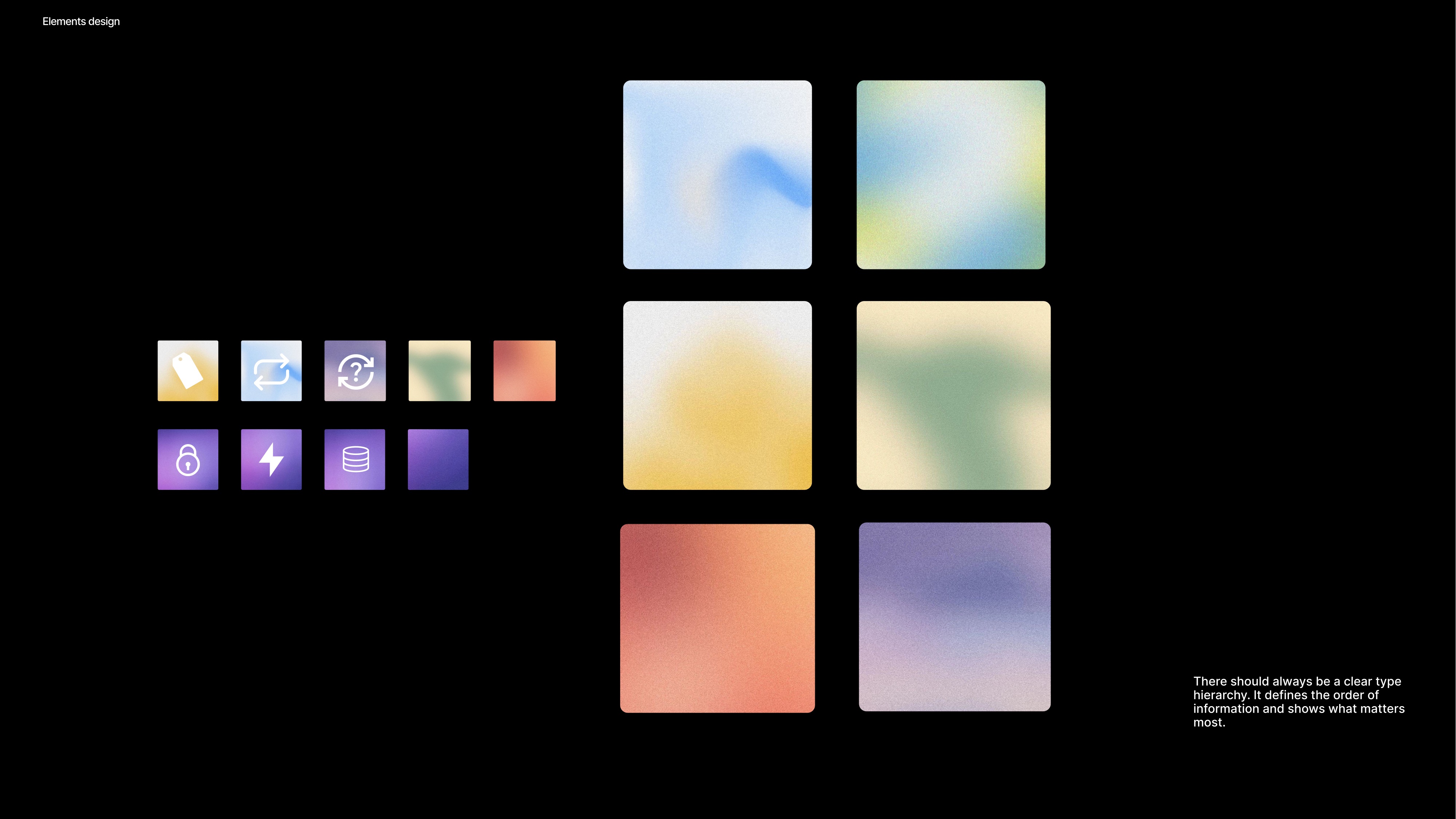
Shade page 7
Shade page 8
Shade page 9
Shade page 10
Shade page 11
Shade page 12
Shade page 13
Shade page 14
Shade page 15
Shade page 16
Shade page 17
Closing thought

Good visual design is a system, not a moment.

Identity, guidelines, campaign assets, and motion — I build them so a brand stays consistent long after the first delivery.

Thank you · Kelly Peng · pengt906@uw.edu